Hover and Pressed States: Deriving Them from the Scale
A button’s hover color should not be computed from its resting color — it should be the neighboring step on the same color scale. On a light theme, hover is one step darker than rest and pressed is one step darker again: a button resting on brand-600 hovers at brand-700 and presses at brand-800. Three real colors from the ramp, not two filtered variants of one.
The rule sounds almost too small to need an article, yet its inverse —
hover states produced by opacity, darken() or a brightness filter — is
among the most common defects in shipped interfaces. Why neighboring steps
win, how far apart they should sit, and why the whole rule flips direction
in dark mode all follow from how color scales are built, which is the
ground covered in our color scales guide.
Why not opacity or a darken() filter?
Because filters leave the ramp. The hover of brand-600 becomes a color that exists nowhere else in the system — unnamed, untested, invisible to the token pipeline — and it misbehaves in three specific ways.
Opacity blends with whatever is behind it. A button at 85 % opacity renders one color on a white page and a different one on a tinted card, so the “same” hover state varies across the product. Worse, the blend can collide with the background: a translucent blue over a warm surface picks up that warmth, and no one ever chose the result.
Channel-based darkening drifts. darken() and its relatives scale RGB
values down, and in sRGB that operation does more than darken: it typically
desaturates, and it can shift hue as channels clip at different rates. The
hover comes out grayer and slightly off-hue — perceived as dirty rather
than deeper.
The filtered color was never contrast-checked. The rest color passed its floors; the filter’s output passed nothing. Text that met 4.5:1 at rest can quietly fail on hover.
The CSS mechanics are the trivial part —
:hover swaps a
custom property or a class. The question was only ever which color the
swap brings in, and the scale already contains the right answer: the step
next door, generated by the same rules, on the same hue, already checked.
How big should the jump between states be?
One step is usually right, and the boundaries on both sides explain why.
The floor is perceptual: a change below the just-noticeable difference reads as no change at all. Scale Composer warns when adjacent steps sit within 0.02 L of each other, because a hover jump smaller than that is a hover users cannot see — the button feels dead even though the stylesheet swears it responds.
The ceiling is identity: a jump of several steps reads as a different color rather than a different state. The button appears to change its mind about what it is, and the eye parses a replacement, not a press. Between those boundaries, one well-built step lands comfortably: clearly visible, still unmistakably the same color. Pressed then takes the step past hover — the interaction deepening in the same direction it began.
What does the walk look like in numbers?
From the blue seed #2563eb — oklch(0.546 0.215 262.9) — the ramp’s
600/700/800 neighborhood comes out like this:
| State | Step | OKLCH | Hex |
|---|---|---|---|
| rest | 600 | oklch(0.52 0.134 262.9) | ≈#3E65B5 |
| hover | 700 | oklch(0.43 0.073 262.9) | ≈#3A4F78 |
| pressed | 800 | oklch(0.34 0.031 262.9) | ≈#2F3848 |
Each move drops lightness by ≈0.09 — roughly four times the 0.02 JND
threshold, so unmistakable, while the hue holds at 262.9° through all three
steps. That hue column is the quiet argument against filters: an sRGB
darken() would not have kept it. The chroma easing off toward the dark end
is the ramp’s own saturation plan at work, which is why the pressed state
reads as the same blue pressed deeper rather than a new, grayer color. The
Scale Composer derives stateNormal, stateHover and statePressed among its
semantic roles exactly this way — neighboring steps on the ramp, assigned
against the surface’s contrast floors.
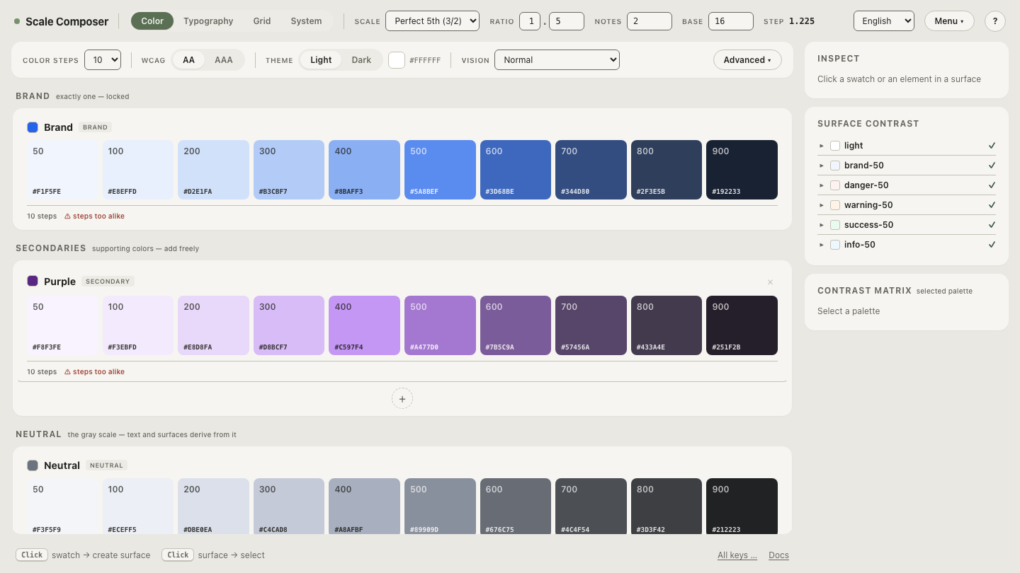
Open this three-step walk in Scale Composer — rest, hover and pressed highlighted as neighbors on the blue ramp, with the lightness gaps between them measured.
What about focus and disabled?
Two states sit outside the walking rule, briefly.
Focus is not a fill change. It is a separate ring role — an outline that must stay visible against both the button and the page behind it. Deriving it as “one more step” buries it; keyboard users need the ring to announce itself, not to blend into the press sequence.
Disabled steps off the interaction logic entirely. It is the low-chroma, low-contrast pair in the role set, and deliberately so: a disabled control communicates by receding. Contrast floors do not apply to it — accessibility guidelines exempt inactive controls — which is why it is the one state that is supposed to fail the checks the others pass.
Why does dark mode flip the direction?
On dark surfaces, hover goes lighter, not darker. The convention comes from elevation logic: in dark themes, surfaces closer to the viewer render lighter, and a hovered control is momentarily “raised”. There is also a plain practical reason — from a dark resting step, darker heads toward black, and the state change drowns.
A derived dark palette gets the flip by construction rather than by exception. Scale Composer derives dark palettes from the same seed with their own lightness curve and a chroma boost of roughly 20 % (dark surroundings mute perceived colorfulness), so the dark ramp’s steps are real, ordered colors of their own — and “move one step in the interactive direction” simply points the other way along them. No theme-specific hover hacks; the rule survives, the direction flips.
Flip the same button onto the derived dark palette — the rest, hover and pressed roles re-derived on the dark ramp, walking lighter where the light theme walked darker.