Why AI Image Generators Miss Your Brand Colors
The prompt seemed airtight. You described the scene, then added the accent
straight from your guidelines — #9A3B2C, copied character for character —
and the generator returned a genuinely good image: right mood, right
composition, and an accent that is… almost your color. A touch too orange.
You regenerate with the hex repeated, this time in capitals. The next image
is good too, and the accent has drifted the other way, toward a dusty pink.
Nothing in the picture is wrong except the one value you specified most
precisely.
AI image generators miss brand colors because a bare hex code is a weak prompt channel: these models have learned associations between words and images, not color management, so an exact value is honored unreliably. The method that works pairs a descriptive color name with the hex — “deep muted brick, around #9A3B2C” — where the name steers and the hex pins; adds a reference image where precision matters; and treats a small correction pass in post-production as part of the workflow. This article is about the single-color problem, the hardest case; it belongs to the larger workflow in our AI and design systems guide.
Why can’t the model just use the hex?
Because nothing inside an image generator looks values up. A generative
image model produces pictures from statistical associations between prompt
words and the images those words described in training. “Brick red” appears
in millions of captions, attached to millions of images that actually
contain brick reds — a strong, well-learned signal. #9A3B2C almost never
appears in a caption, and where hex strings do occur in training text, they
are rarely bound tightly to the pixels beside them. To the model, the color
name is a paved road and the hex code a faint trail. Generators often get
near a prompted hex — the digits still carry some signal — but “near, with
variance” is exactly what a brand specification cannot tolerate.
There is a second, physical layer to the miss. Generators render scenes, and scenes have light and material. The same nominal surface color reads warmer under window light and cooler in shade; a matte wall and a glazed mug drift apart even when both are technically “correct.” No generator is a color management system — your brand color passes through simulated lighting before it reaches you. Print designers know a version of this lesson already: a brand color has never been one absolute number across media, which is why translating an ink to a screen is an act of judgment rather than a formula.
What works better than a bare hex?
A pair: a descriptive color name plus the hex. Deep muted brick, around #9A3B2C. The name does the steering, because it maps onto visual concepts the model has genuinely learned; the hex pins the neighborhood, ruling out the terracottas and maroons that “brick” alone would admit. Even the word around is doing honest work — it asks for what the model can actually deliver. OpenAI’s prompting guide for its image models points the same direction: concrete, descriptive visual language is the channel these systems respond to.
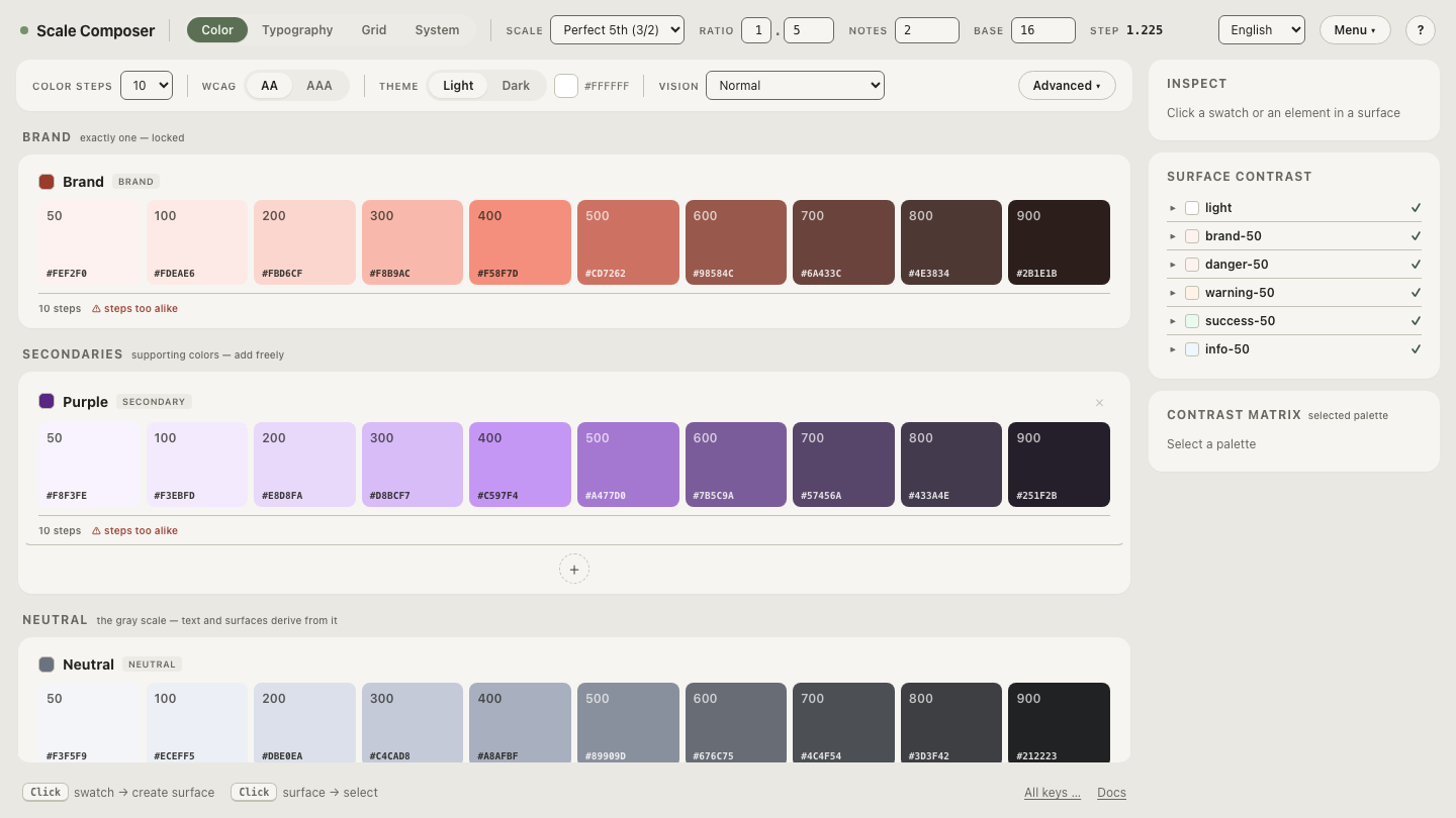
The name has to be descriptive to work. “Brand Rust 500” means something to your design system and nothing to the model; “deep muted brick” is a phrase the training data taught it. Which surfaces the quiet precondition of the whole technique: you can only prompt with color names if every tone in your palette has one. Open a palette in Scale Composer and read the accent’s name and value side by side — a palette where each tone carries a human-readable name and a hex is prompt vocabulary, ready-made.
Do negative prompts work for color?
Poorly, on natural-language generators. Models in the gpt-image and Veo
class attend to the nouns in a prompt more strongly than to the logical
operators around them — forbid a color and you have just placed that color
into the model’s working context. “Not orange” often yields more orange;
“no purple tones” invites purple. The fix is structural, not emphatic:
describe the state you want, positively. Instead of “not orange,” write
“cooler than terracotta, leaning brown.” The --no parameter on Midjourney
and Stable Diffusion is a genuine exception — separate syntax, processed
differently from prose — but even there the craft is to use it sparingly and
let the positive description carry the weight.
What about black-and-white with one brand accent?
Selective color — a monochrome scene with a single colored element — is a known weak spot, and the reason it fails generalizes. A prompt describes the whole image; the model has no mechanism for scoping an instruction to one object. Write “the scarf is the only warm element” and you have made a statement about everything else — the model may oblige by chilling the entire scene. The phrasing that works describes the accent’s relationship instead of its exclusivity: “a scarf in deep muted brick, discreet warmth, slightly warmer than everything around it.” Even then, expect leakage — a faintly tinted “black and white,” a second object borrowing the accent — and plan for it. This is the clearest case where the reference image and the correction pass stop being fallbacks and become the plan.
How close is close enough?
That depends on where the image lands, and it defines the workflow. For mood and campaign imagery, the name + hex pair usually lands within acceptable range on its own. Where precision matters — product shots, UI mockups, anything adjacent to the logo — add a reference image: image inputs carry the color itself rather than a description of it, and they are the strongest exactness channel these systems offer. And when the brand requires an exact hit, the last step is post-production. A selective hue correction is a small, local edit when the generated color is already close — which is precisely what the first two steps buy you. Treating the correction pass as a failure is the mistake; it is the same finishing discipline print production has always had.
The technique compresses to one line: name it, pin it, reference it, correct it. And it rests on a palette in which every tone already has a name — highlights and midtones as much as the accent, because the companion problem to an accent that misses is a background that drifts — which is why prompting with a full palette is a technique of its own. Load a full palette and read it as prompt vocabulary — each tone named and pinned, from warm ivory highlight to brick accent, the raw material for every technique in this hub.