Pantone to Screen: Translating Print Brands
A brand that grew up in print knows its color as an ink. The brand book names the swatch, the printer mixes it, and every business card comes back matching the last one. Then a website project starts, a developer asks for the hex value — and three answers surface: one from a conversion website, one eyedroppered out of an old PDF, one from the agency that ran the last campaign. All plausible. All different. And nothing in the brand book says which one is right.
There is no exact Pantone-to-hex conversion, because a printed ink and a screen produce color through different physics, and some inks sit outside what ordinary screens can show at all — every published equivalent, including the official ones, is an approximation. The reliable method: take the brand book’s screen value if it has one; otherwise match by eye against the printed swatch; then commit to that single value as canonical and derive every digital color from it. This article walks through why the shortcut doesn’t exist and what to do instead, with a worked orange — part of our brand colors guide.
Why is there no exact Pantone-to-hex value?
Three reasons stack on each other.
The first is physics. A spot color is a pre-mixed ink: it makes color by absorbing part of the light that falls on the paper and reflecting the rest. A screen makes color by emitting its own light. A useful analogy is asking a piano to play a violin phrase — the same pitches are available, the same voice is not. It is only an analogy, but it holds where it matters: the two instruments agree closely on many colors and simply cannot agree on some.
The second is range. The set of colors spot inks can reach and the set an ordinary screen can reach overlap heavily but not completely. Vivid oranges, metallics and certain teals are the classic examples of inks that sit outside the standard screen range entirely — a nearest screen color exists, but it is visibly tamer than the printed original.
The third is that “the ink’s color” is itself a moving target. The same ink reads differently on coated and uncoated paper, and differently again under warm shop lighting and gray daylight. A conversion has to pick one of those appearances to match — which is why official Pantone-to-screen tables are published as approximations, with disclaimers, rather than as facts.
How do you choose the screen value?
In order of preference:
Take the official value if one exists. Many brand books written in the last decade print a hex or RGB value next to the ink. Use it even if you suspect a slightly better match is possible — for a brand color, coordination beats precision, and the official value is the one every other partner will also find.
Otherwise, match by eye. Put the printed swatch — the real one, on the brand’s actual paper — next to a calibrated screen under neutral light, and adjust until the screen color reads as the same color. This is a place where the eye genuinely beats the formula: a formula can only convert a published reference, while your eye is comparing your ink on your paper against the actual screen. What you are matching is the color the brand ships, not the color a catalog describes.
One note on newer hardware: wide-gamut (P3) displays reach some inks that ordinary screens cannot, which narrows the gap for part of the out-of-range list — worth recording in the brand book, not a change of method.
Why does committing matter more than being exactly right?
Because the real damage is rarely the approximation — it is five approximations in circulation.
People do not carry the swatch with them; they carry an accumulated memory of every meeting with the color. One committed screen value means every website visit, app session and social post deposits into the same memory. Five near-misses each deposit into a slightly different one, and the color that should be sharpest in mind goes blurry — not because any single value was wrong, but because no single value was chosen.
There is a mechanical version of the same argument. Every digital color decision downstream — the pale tint behind a testimonial, the darker shade where white text needs to stay readable, the hover state on a button — is derived from the base value. Five bases quietly produce five families of tints and shades, and the divergence grows with every derived step.
What does the method look like on a real color?
Take a vivid orange spot ink — squarely in the class with no exact screen
twin. Suppose the file audit turns up three candidates: #FF6600 from an
early web style guide, #F96815 eyedroppered from a print PDF, #FF6A13
from a conversion site. Side by side with the printed swatch under neutral
light, the middle one reads closest — the flat #FF6600 runs hotter and
brighter than the ink ever prints. So #F96815 becomes the committed twin,
and the other two are retired.
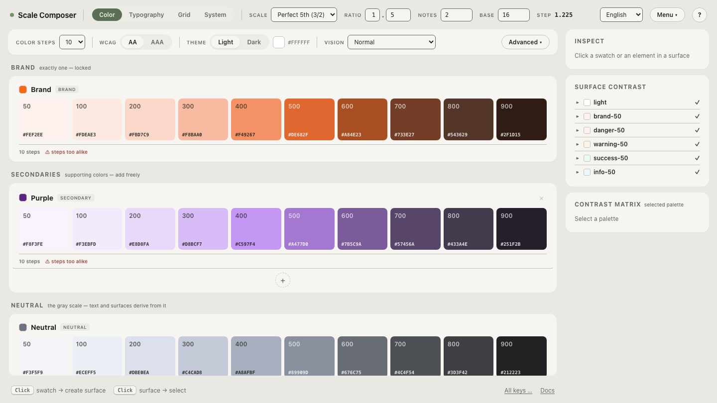
From that one value, Scale Composer derives the digital family: a pale peach
for tinted backgrounds (≈#FFE9DC), the twin itself for brand fills, a
darker step for fills that must hold white text (≈#C24E08), and a deep rust
for orange text on light surfaces (≈#7A3403). Each is generated from the
single committed value, so the whole digital family agrees with itself — the
property the three circulating candidates never had.
Open the committed orange and the ramp derived from it in the Scale Composer — the twin sits mid-ramp, with the tints and shades one committed value produces.
What about the gap that remains?
For an ink outside the screen’s range, the committed twin is a sibling, not a clone — the printed orange will stay a touch hotter than the screen orange, permanently. That is an acceptable outcome, not a failure: each version is the closest expression of the same color its medium allows, and each is judged inside its own medium. The failure mode worth worrying about is not print-versus-screen divergence, which physics imposes; it is screen-versus-screen divergence, which is entirely preventable — and is exactly what the commitment prevents.
What should happen after you commit?
Write the pair down in the brand book, in both directions: the ink names its screen twin, the screen value names its ink. Retire the other candidates explicitly — an approximation that isn’t marked obsolete will be found and reused. Then derive the digital system from the twin, so the commitment propagates instead of stopping at one swatch. Commit a screen twin for your own print color and derive its family — one value in; the tints, shades and text pairings out.