The Grid view
Breakpoints, columns, gutters, margins, and a global max-width — where every measurement steps through the same scale as your type and color.
The toolbar

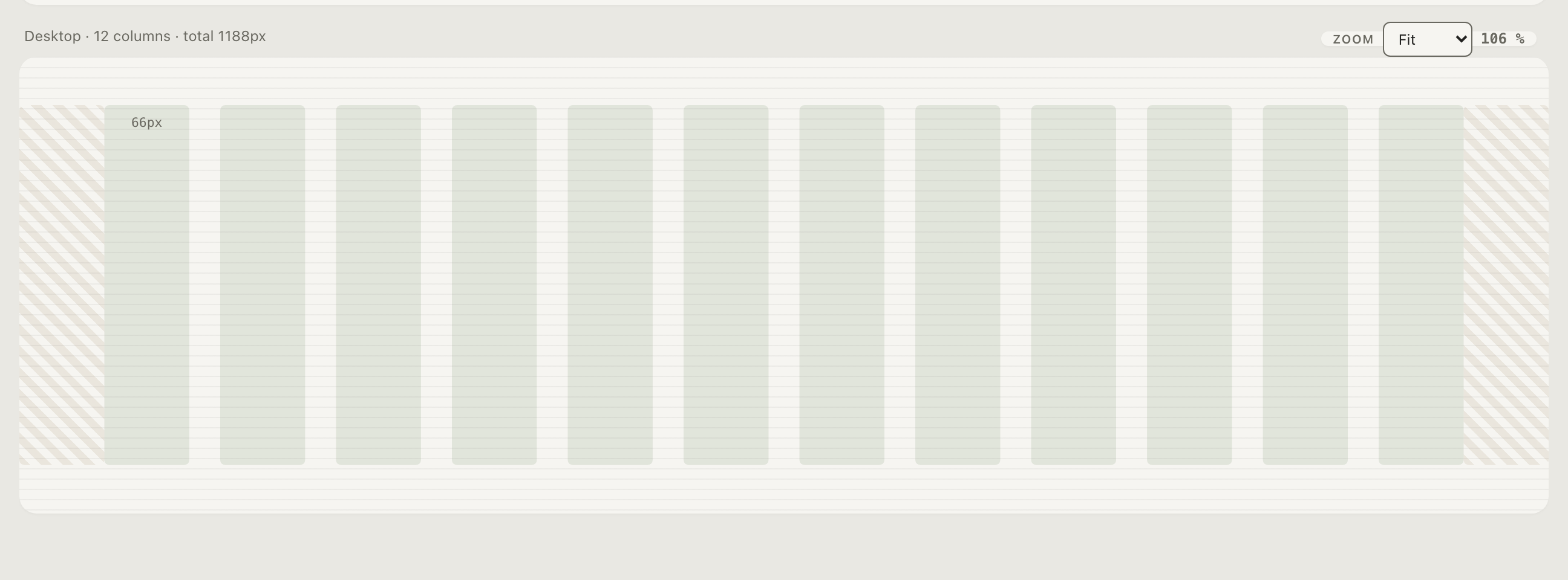
Each breakpoint is a tab: mobile, tablet, desktop by default (4 / 8 / 12 columns — the industry convention), with min-width, preview width, column count, gutter, and margin. Add or remove breakpoints freely; the labels are content and editable.
Max-width is global and — when enabled — a hard cap: an arrow step that would push the total width past it is stopped with a toast, instead of silently succeeding and warning afterwards. The one remaining warning pill appears only when you lower the cap under an existing total.
Stepping
Select a column, gutter, or margin and:
- ← / → — step the measurement through the global scale. A gutter moves 16 → 21 → 28, never to an arbitrary value.
- Shift+← / → — change the column count.
This is the point of having the grid in the same tool: the whitespace rhythm of your layout and the size rhythm of your type come from the same progression, so they cannot quietly diverge.
The baseline is not set here

The stage shows the baseline raster, but the baseline unit is derived
from the scale — base ÷ 2, displayed with its derivation spelled out
(8px (16/2)). Change the base in the topbar and the baseline follows.
The grid view displays it; the scale owns it.
The Typography view’s column overlay mirrors the largest breakpoint from here — one owner, one direction of truth.
Theory
Layout grid guides — column anatomy, gutter proportions, choosing breakpoints — and spacing guides for the 8-point thinking the baseline builds on.