Optical Sizes: Why Small Text Needs Different Shapes
An optical size is a version of a typeface drawn for the size it will actually be used at: small-size versions get sturdier strokes, a taller x-height, more open apertures, looser spacing and simplified detail, while large-size versions get finer contrast and a tighter fit. A single outline stretched across every size — the digital default for decades — is a compromise at both ends: slightly too delicate at caption sizes, slightly too coarse at display sizes.
For most of type’s history this adaptation wasn’t a feature; it was physics.
This article is part of our typography guide; it covers
where optical sizes came from, what the modern opsz axis restores, and what
to do when your font doesn’t have one — which is still the common case.
Why did metal type cut different shapes for each size?
A metal typeface wasn’t a file. It was cabinets of physical letters, cut and cast separately for every size — for most of that history there was no way to scale a 12-point letter into a 6-point one, so each size was drawn by hand. Punchcutters used that necessity well: the 6pt cutting of a face had wider letterforms, lower stroke contrast, more open apertures and looser spacing than the 72pt cutting of the “same” design, because centuries of looking had taught them what small type needs to survive ink, paper and eyes.
When digital type collapsed a family into one mathematically scalable outline, it gained enormous convenience and silently lost the adaptation. The physical necessity had been encoding perceptual wisdom — remove the necessity and the wisdom went with it.
The intuitive reason the wisdom mattered: ink and eyes don’t scale linearly. Halve a letter’s size and its fine details don’t become half as visible — they drop below what the eye resolves and what the screen can render. Thin strokes evaporate, small counters clog, tight letterfit turns to crowding — legibility, the letter-recognition half of reading, is what fails first. So small sizes need robustness. At display sizes the pressure reverses: every sturdiness that saved the 6pt cut is magnified into plain view, and the size rewards finesse instead — hairline contrast, tight fit, sharp detail.
What does optical sizing actually adjust?
Five adaptations, all pushing the same direction — down in size, toward robustness; up in size, toward finesse:
| Property | At small sizes | At large sizes |
|---|---|---|
| Stroke contrast | lowered — thins thickened so they don’t vanish | raised — hairlines become an asset |
| x-height | taller — more letter in the same nominal size | relatively smaller — room for elegance in ascenders |
| Apertures | opened — e, c, a stay distinct | can close — distinctness is free at 60px |
| Spacing | loosened — crowding is what kills small text | tightened — large text otherwise falls apart into letters |
| Detail | simplified — fine serifs and terminals coarsened or dropped | refined — the size can finally show them |
Read down the small-size column and it describes a sturdy, open, slightly plain workhorse; read the large-size column and it describes something close to a display face. That is the point: they are different tools that happen to share a name.
How does the opsz axis bring optical sizes back?
Variable fonts re-automated the old adaptation. A font that carries the opsz axis contains the small-size and large-size behavior as a continuous range inside one file, and CSS applies it with:
html {
  font-optical-sizing: auto; /* the default */
}
Because auto is the initial value, browsers — support is broadly available
across modern engines — set the axis from the font size without being asked:
your 12px captions quietly get the sturdier drawing, your 64px display line
the finer one.
The honest caveat: only a minority of fonts carry a real opsz axis. The
known carriers are the large variable projects of the Source Serif and Roboto
Flex class; for everything else, font-optical-sizing changes nothing,
because there is no axis to drive. The property is a switch, not a synthesizer
— it cannot invent adaptations a font doesn’t contain.
What can you do without an opsz axis?
Two compensations, both older than the axis:
- Choose faces designed near your working sizes. Text faces — drawn with the small-size column’s virtues baked in — for UI and body; display faces for headlines. This is the same logic that makes display faces a separate category at all: they are, in effect, large optical sizes sold on their own.
- Compensate manually at the extremes. At caption sizes, slightly opened letter-spacing and a half-step heavier weight recover part of what a true small cut would provide; at display sizes, tighten the spacing. The size-by-size tracking and weight conventions are covered in our type scale guide.
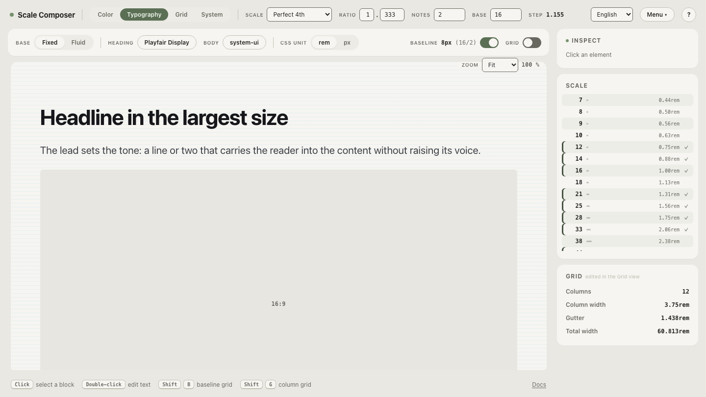
Scale Composer has no optical-size control — its role here is the specimen: set the same face at your scale’s caption and display steps and inspect the small end the way a punchcutter would, in real rendered text. The per-style weight and letter-spacing controls are exactly the two manual levers from compensation two.
What does the difference look like on a real scale?
Set the word “Regeneration” in a high-contrast serif at the caption and display steps of a 16px perfect-fourth scale — 12px and 51px:
At 12px, the single outline struggles on all five counts. The hairline strokes render a pixel wide at best and the letters look gray and brittle; the counters of e and a half-fill; the tight display-grade spacing reads as crowding; the delicate serifs smear. A true caption cut would even out the strokes, raise the lowercase, open the apertures, air out the fit and simplify the serifs — the word would look plainer under a loupe and far clearer at arm’s length.
At 51px, the same outline is serviceable but slack. Spacing that felt crowded at 12px now looks loose between big letters, and the modest contrast a compromise outline keeps for safety reads as flat where the size could carry drama. A display cut moves every one of the five dials the other way.
One outline, two sizes, opposite complaints — which is the whole argument for optical sizes in a single word.
Audit your own scale’s extremes
The compromise shows up first at your scale’s smallest step, so start the audit there: check whether your body face carries an opsz axis, and if it doesn’t, judge the caption step in real text and apply the manual compensation — opened tracking, a half-step more weight — as the style’s own settings rather than a per-use exception. To run that check on live type, open your scale’s smallest and largest steps side by side.