Vertical Spacing Between Text Blocks
Try this on any article: give every heading the same margin above and below — 24px each side — then scroll the page and ask of each heading, which section does this belong to? Symmetric margins make the answer genuinely ambiguous: each heading floats exactly halfway between the text it closes and the text it opens. Now give the same headings 32px above and 16px below. Nothing else changes, yet every heading visibly attaches itself to the content that follows it, and the page reads as sections instead of an even stack of blocks.
Vertical text spacing comes down to four rules: paragraph gaps of two to three baseline units, heading margins that are asymmetric — distinctly more space above than below — list items set tighter than paragraphs, and every one of those distances taken from the spacing scale rather than chosen per element.
This article works through each rule, the perceptual reason the asymmetry works, and a full worked stack — heading, paragraphs, subheading, list — with real values. It applies the scale thinking from the wider spacing hub to the specific problem of text.
How much spacing goes between paragraphs?
Measure it in baseline units rather than ad-hoc pixels. The baseline unit is commonly half the body text size — 16px body gives an 8px unit — and paragraph gaps of two to three units (16–24px) cover most text settings.
The bounds matter on both sides. A paragraph gap has one job: to be visibly larger than the gap between lines inside a paragraph, without growing so large that consecutive paragraphs stop reading as one text. At 16px body text with a 1.5 line height, the visible whitespace between lines is roughly 8px; a 16px paragraph gap is double that — clearly a boundary, clearly not a section break. A 24px gap approaches a full blank line and suits looser, editorial settings. Below two baseline units, paragraphs start to blur into one another; much above three, the text begins to fall apart into fragments.
Why should headings have more space above than below?
Because a heading is a label for the section below it, not a divider between two sections — and space is how you say so. The large gap above announces that the previous section has ended; the small gap below binds the heading to its own first paragraph.
The perceptual basis is the principle of proximity from Gestalt research on grouping: elements that sit close together are perceived as belonging together, before any reading happens. A reader scanning past a symmetric heading has to read it to know which section it labels; an asymmetric one is grouped correctly at a glance. A working ratio in many text settings is roughly 2:1 above-to-below — 32px above and 16px below for a main heading.
How tight should list items be?
Tighter than paragraphs. List items are parallel parts of a single thought, and their spacing should say so: one baseline unit (8px) between items, against the 16px paragraph gap, keeps the list reading as one unit. If items regularly run to several lines each, they start behaving like small paragraphs and deserve a step up — 11px or 16px. The list block as a whole separates from surrounding paragraphs by the normal paragraph gap, so the list sits in the text rather than floating between texts.
What does a full article stack look like in numbers?
Every value below is a step from one spacing scale — base 16, ratio 2, two notes per doubling, which generates 8, 11, 16, 23, 32 — and the baseline unit is the base halved, 8px:
| Element | Space above | Space below |
|---|---|---|
| h2 | 32px | 16px |
| Paragraph | — | 16px |
| h3 | 23px | 11px |
| List item | — | 8px |
| List block | 16px | 16px |
Both heading levels keep roughly the 2:1 asymmetry (32/16 and 23/11), and the h3 steps down one scale position from the h2 on both sides, so the hierarchy stays proportional. The pairing isn’t a coincidence you have to maintain by hand: with two notes per doubling, any step is exactly twice the step two positions below it — the 2:1 heading asymmetry falls out of the scale’s own arithmetic.
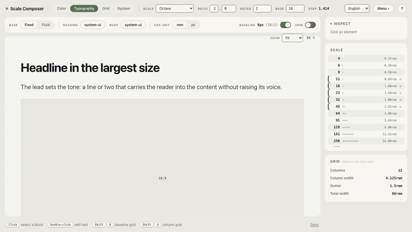
Open the scale behind this stack in Scale Composer — the five values in the table are consecutive steps of one generated scale, and the 8px baseline unit is the 16px base halved.
One implementation note: prose is the place where element margins — rather
than a parent’s gap — remain the natural tool, because the right distance
depends on the pair (heading-to-paragraph differs from paragraph-to-paragraph)
and a uniform gap can’t vary per pair.
Margin collapsing, so often a bug in
app layout, works for you here: the paragraph’s 16px bottom margin meets the
h2’s 32px top margin and collapses to 32px — exactly the value you wanted, with
no special-casing.
Where do the spacing values come from?
From the same scale that spaces everything else. The formula
size = base × ratio^(i/notes) turns three numbers into the whole menu, and
text spacing simply uses the lower half of it: 8 for list items, 11 and 16 for
paragraph-level gaps, 23 and 32 for heading approaches. That means text
spacing isn’t a second system to maintain — the article stack, the component
padding, and the page gutters all resolve to steps of one scale, which is what
keeps a content page and a product screen from the same team looking related.
See the asymmetry do its work
The fastest way to internalize the heading rule is to change the arithmetic underneath it and watch the pairs move. With two notes per doubling, the above/below pair two steps apart is exactly 2:1; regenerate the same scale with three notes per doubling and that pair loosens to about 1.6:1 — a gentler asymmetry that suits dense documentation, at the cost of some of the snap. Judge the difference yourself: open the heading-margin state and switch the notes.