Baseline Grid vs 8pt Grid: The Difference
A baseline grid and an 8pt grid quantize different things. The baseline grid quantizes text rhythm — the invisible horizontal lines that lines of type sit on. The 8pt grid quantizes space — how far apart elements sit and what size they are. They answer two different questions, and they combine cleanly when the baseline is derived from the body text size.
This article covers what each grid controls, how to make the two share a single quantum, and how much of the print tradition realistically survives contact with CSS. It’s one corner of the wider spacing foundations.
What does a baseline grid control?
In typography, the baseline is the invisible line the letters rest on. A baseline grid repeats that line at a fixed interval down the page — every 8px, say — and asks every line of text to land on one of the repeats. It’s an inheritance from print composition, where columns set side by side had to align line-for-line, and text printed on the back of a thin page showed through less when its lines sat directly behind the front’s.
The baseline grid governs typography’s vertical dimension: line heights, the heights that text blocks end up with, and the steady interval at which lines of type recur. It says nothing about horizontal spacing, and nothing about elements that aren’t text.
What does the 8pt grid control instead?
The space between and around things: margins, padding, gaps, and component sizes as multiples of 8. It’s indifferent to text rhythm — a card can have perfectly 8-gridded padding while the paragraph inside it runs on a 22px line height that never lands anywhere in particular. One grid decides how far apart things sit; the other decides where lines of text return. Neither implies the other, which is why a team can adopt the 8pt grid and still ship pages with no vertical rhythm at all.
How do the two grids combine?
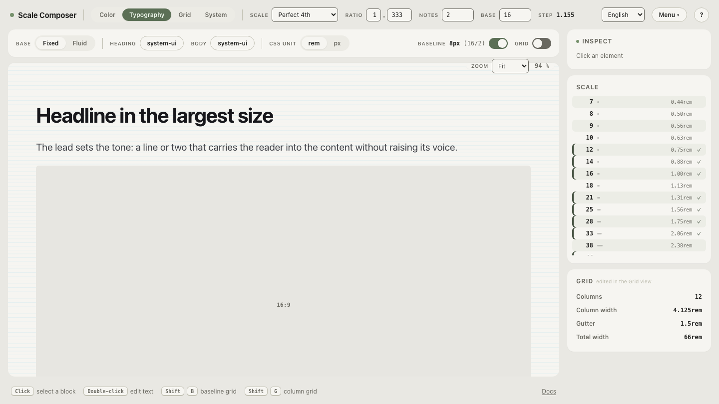
By deriving the baseline unit from the body text size — half of it is a common convention. Body text at 16px gives an 8px baseline, and now both grids share one quantum: layout spacing runs on multiples of 8, and so do line heights. In Scale Composer, that derivation is built in — the baseline is half the base, so the same number that generates the spacing steps sets the rhythm unit.
Here is what it looks like with type sizes drawn from a scale (base 16, ratio 2, two notes per interval):
| Text style | Size | Line height | Baseline units (8px) |
|---|---|---|---|
| Body | 16px | 24px | 3 |
| Lead paragraph | 23px | 32px | 4 |
| Heading 2 | 32px | 40px | 5 |
| Heading 1 | 45px | 56px | 7 |
| Paragraph spacing | — | 24px | 3 |
Every line height and every vertical margin is a multiple of 8, so any stack of these styles adds up to a whole number of baseline units — text and layout stay commensurable no matter how they’re combined.
Open this scale with its baseline in Scale Composer — the 16px base derives the 8px baseline, shown alongside the type sizes the same scale generates, so you can check each line height against the rhythm unit.
Does strict baseline alignment work on the web?
Mostly not in the print sense, and it’s worth being honest about why. CSS builds text out of line boxes: the type is centered inside its line height, with the extra space split above and below, rather than seated on a baseline you can pin. Forcing actual baselines onto a global grid takes per-style offset arithmetic that depends on font metrics — arithmetic that has to be redone whenever a typeface, a size, or a browser default changes.
The pragmatic middle ground keeps most of the benefit at a fraction of the effort: make line heights and vertical margins between text blocks multiples of the baseline unit. Blocks of text then consume whole numbers of rhythm units even though the baselines inside them aren’t individually pinned. The rhythm holds between elements — headings, paragraphs, cards, captions — which is where it is easiest to see anyway.
Why does the rhythm matter if readers can’t see the grid?
Readers don’t perceive the grid itself — what they perceive is the return of the eye: finish a line, drop, land on the next one at a steady interval. When that interval holds across paragraphs, captions, and list items, the page reads as one continuous rhythm; when it changes at every boundary, each transition costs a small re-aim. The baseline grid is a means to that steadiness, not the thing being looked at — which is also why the pragmatic version above is usually enough. The reader experiences the returns, not the mechanism behind them.
Carry the rhythm into columns
Baseline discipline covers the vertical axis; layout has a horizontal one too. Open the grid view with the same scale loaded — column widths, gutters, and margins step through the same scale that set the baseline, at 4 columns on mobile, 8 on tablet, and 12 on desktop. Step a gutter up and down the scale and both axes stay explained by one base: vertical rhythm from half of it, horizontal structure from its steps.