Touch Targets: Why 44px Matters
The archive and delete icons sit side by side at the end of every row in the mail app, each drawn at 24 pixels, each padded to a 32px target, no gap between them. A thumb’s contact patch is wider than either. You aim at archive, the tap lands a few pixels right of where you looked, and the message is gone. Nothing in the visual design is wrong — the icons are crisp, aligned, on the grid. The hit areas failed.
A touch target is the region that accepts the tap — the hit area, not the visible control — and the major guidelines agree on its floor: Apple’s Human Interface Guidelines recommend at least 44×44pt, Material Design specifies 48×48dp, and WCAG 2.2 makes 24×24 CSS pixels a Level AA requirement (Success Criterion 2.5.8), with exceptions for well-spaced targets.
Meeting those floors is mostly arithmetic — padding, gaps, and sums drawn from the same spacing system that sizes everything else. This article covers where the numbers come from, how padding turns a small visual into a comfortable target, and why the space between targets counts as much as the targets themselves.
Where do 44px and 48px come from?
Units first: iOS points, Android dps, and CSS pixels are all density-independent units of comparable physical size, so the guideline numbers can be compared directly even though they are not formally identical. 44pt on a typical iPhone and 48dp on a typical Android phone both come out near 7mm of physical screen — in the neighborhood of a fingertip’s contact patch.
The research background is Fitts’s law, declared here as background rather than a formula to apply: pointing gets faster and more accurate as targets get bigger and closer, and touch studies consistently find error rates climbing sharply once targets shrink below roughly 7mm of physical size. The platform floors sit just above that knee, rounded to grid-friendly values in each platform’s unit — 44 and 48 are not magic, they are the point where mis-taps stop being routine, expressed in numbers that compose with 4- and 8-based spacing.
The third floor is newer and lower. WCAG 2.2’s Target Size (Minimum) — Success Criterion 2.5.8, Level AA — requires targets of at least 24×24 CSS pixels, with exceptions: a smaller target conforms if it is spaced so that a 24px circle centered on it overlaps no neighboring target or its circle, if the same action is available through a larger control, or if the target is a link inside a sentence. Because many regulations and procurement rules reference WCAG’s AA level, 24px is the closest thing the field has to a legal floor. It is a floor, though — comfortable touch UI sits at 44–48, and the gap between “conforms” and “comfortable” is exactly the gap between a lawyer’s question and a designer’s.
Is the touch target the same as the visible control?
No — and the distinction is where most fixes live. The visual can stay small; the hit area grows by padding. A 24px icon with 12px of padding on every side is a 48×48 target (24 + 2 × 12 = 48): the icon you see is a quarter of the area you can hit.
The intuitive reason padding works: you aim with your eyes at the visual, but you land with a patch of skin larger than most glyphs, and taps scatter around the intended point. The padding is where the scatter lands. A 24px visual with 12px of padding forgives a miss of up to 12px in any direction; the same visual with 4px of padding punishes anything past 4.
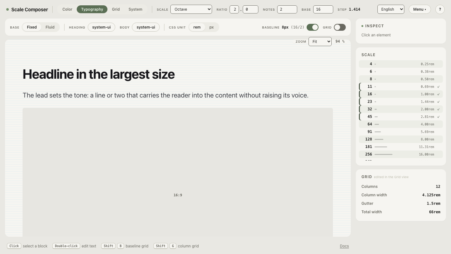
On the modular scale used across these articles — base 16, ratio 2, two notes, generating 8, 11, 16, 23, 32, 45, 64 — hit-area padding is a place where the 4pt sub-grid earns its keep. 12 is not a step of the ratio-2 scale, but it is on the 4pt layer, and it lands the sum on Material’s 48. The scale’s own 11 step works too: 24 + 2 × 11 = 46, clear of Apple’s 44 and far above WCAG’s 24. Both are defensible; 12 also keeps the total on the 8-multiple that toolbar heights tend to be. The division of labor is the usual one — the scale supplies the icon sizes and the gaps, the 4pt layer tunes the sum.
What does a tappable toolbar look like in numbers?
A worked example: four controls in a mail toolbar on a 360px-wide screen.
| Control | Visual size | Padding | Hit area | Gap to next |
|---|---|---|---|---|
| Back | 24px icon | 12px | 48×48 | 8px |
| Archive | 24px icon | 12px | 48×48 | 8px |
| Delete | 24px icon | 12px | 48×48 | 8px |
| Search | 16px icon | 16px | 48×48 | — |
Four 48px targets and three 8px gaps span 216px — comfortable on a 360px screen with room left for a title. Two details carry the lesson. Search draws its glyph at 16 (an exact scale step) and pads with the 16 step to the same 48 total: visual sizes may vary while hit areas stay uniform. And delete sits one 8px gap away from archive — enough that a near-miss dies in the gap; destructive actions often deserve more separation or a confirmation on top, but that is a placement decision, not a size one.
Open the scale these numbers come from — 8, 11, 16, 23, 32 — and read the toolbar off it: the 8 step is the gap, 16 the small icon and its padding, with the 4pt layer supplying the 12.
Do gaps between targets count?
Yes — spacing between targets buys accuracy the same way size does. Taps scatter around the aim point, so the seam between two adjacent targets is where misses stop being harmless: two 48px targets with zero gap between them still produce wrong-action taps at the shared edge, because near that edge roughly half the scatter lands on the neighbor. An 8px gap turns the seam into dead space — a miss there does nothing, which is recoverable, instead of doing the wrong thing, which may not be.
WCAG encodes the same trade explicitly: its spacing exception lets an undersized target conform when it is isolated enough, which is the standard admitting that effective target size is size plus separation. The densest safe layout is rarely the maximum number of touching targets — it is one target fewer, with gaps.
When is a smaller target acceptable?
WCAG’s exceptions sketch the honest answer: links inside a sentence are exempt, a small target passes when the same action exists as a larger control elsewhere on the page, and the spacing exception covers dense-but-isolated layouts. Beyond conformance, context matters — mouse pointers tolerate smaller targets than fingers do — but hybrid laptop-tablet devices blur the line, so when input is uncertain, the touch floors are the safer default.
Make the toolbar denser without losing the floor
Sometimes 48s genuinely don’t fit — more controls than the row has room for. The move is not to shave padding by feel but to re-derive it: open the same scale with a third note per octave and the menu gains steps at 10, 13, 20, and 25. Pad the 24px icon with the new 10 step and the hit area lands on 44 exactly — Apple’s floor — buying 4px back per control while every number stays derived rather than improvised.