Icon Sizes on the Grid (16, 20, 24)
The most common UI icon sizes — 16, 20, 24, and 32 pixels — are bounding-box sizes: each number names the square container an icon is drawn in, not the artwork inside it. The menu is short for the same reason spacing menus are short, and it aligns with everything else: all four values sit on the 4px grid, and 16 and 32 are exact steps of the modular scale many systems generate their spacing from.
This article covers where the standard sizes come from, why two icons at “the same size” can look different sizes, which icon size belongs next to which text size, and how to align the pair once it’s chosen — the icon-shaped corner of a complete spacing system.
Where do the standard icon sizes come from?
The same pressures that produced the 8-point grid. Multiples of 4 survive the 1.5×, 2×, and 3× density factors screens render at without landing on half-pixels, and a bounding box that shares its arithmetic with the spacing menu composes cleanly — a 24px icon with 12px of padding on each side is a 48px control, no remainder. Within the menu, each size has a job: 16 suits dense text UIs and inline use (it matches the classic body size), 24 is the comfortable default most icon sets are drawn at, 20 splits the difference for compact interfaces, and 32 and up serve empty states and feature illustrations.
On a shared modular spacing scale — base 16, ratio 2, two notes per doubling, generating 8, 11, 16, 23, 32, 45, 64 — the icon sizes land on or near the steps: 16 and 32 are exact, 24 sits one pixel above the 23 step, and 20 belongs to the 4pt layer between steps. On or near is enough. What has to stay on the grid is not the icon alone but the sum — box plus padding — because that sum is the size neighboring elements space themselves against.
Why do two icons at the same size look different sizes?
Because the number names the box, and sets differ in how much of the box they use. Icon sets draw their glyphs inside a live area with built-in padding: Material’s system icons, for example, are designed on a 24px grid whose artwork stays inside a 20px live area, with 2px of trim on every side. A “24px” Material icon is really about 20px of drawing in a 24px box.
That padding is not waste — it is how a set balances optical size. Shapes fill the eye unequally: a solid square drawn to the same bounds as a thin outline circle reads distinctly larger, so sets give round and diagonal forms a little more extent and dense square forms a little less, all inside one shared container. Consistency lives in the box; the artwork varies deliberately within it.
The practical consequence: mixing icon sets is how interfaces get subtly lumpy. If one set keeps about 20px of artwork in its 24px box and another keeps about 22px, the second set’s icons render roughly 10% larger at the same nominal size. Nothing is measurably wrong — every box is 24px — yet the toolbar looks uneven. The reliable fixes are to stay inside one set, or to rescale imported glyphs to your set’s live area before shipping them.
Which icon size belongs next to which text size?
A worked pairing from the scale above (base 16, ratio 2, two notes), with line heights on its 8px baseline — the baseline is half the base, so text rhythm and icon boxes share a quantum:
| Context | Text size | Line height | Paired icon (fixed) | Icon at 1em |
|---|---|---|---|---|
| Caption, meta, helper text | 11px | 16px | 12px | 11px |
| Body, labels, menu items | 16px | 24px | 16px | 16px |
| Subheadings | 23px | 32px | 24px | 23px |
| Page titles | 32px | 40px | 32px | 32px |
Read the two right-hand columns as competing policies. The fixed column snaps each context to the nearest size the icon set actually ships (12, 16, 24, 32), so glyphs render at the size they were drawn for and strokes stay on whole pixels. The 1em column sizes the icon in em units so it follows its text exactly — an icon inside a 23px subheading renders at 23px, drawn size or not.
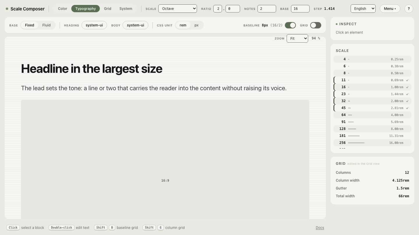
Open the scale behind this table in Scale Composer — base 16, ratio 2, two notes — and read off the steps the text column comes from: 8, 11, 16, 23, 32, 45, 64, with the 8px baseline underneath the line heights.
Should icons be sized in px or em?
Fixed steps tend to win in UI chrome — toolbars, navigation, buttons, table rows — where an icon’s neighbors are other icons and grid-sized controls rather than sentences. Crispness matters most there: artwork drawn to whole pixels can land on fractions when rescaled, and a column of icons next to mixed text sizes still wants one icon size for the column to read as a column.
Em sizing tends to win inside flowing text: an external-link arrow, an inline
status mark, an icon inside a heading that user font settings may resize.
There the icon’s only neighbor is its own text, tracking that text beats pixel
crispness, and 1em follows every future font-size change with no further
bookkeeping. Many systems run both policies at once, scoped — fixed in chrome,
em in prose — which is how the table above is meant to be read.
How do you vertically align an icon with its text?
Optically — against the text’s x-height or cap height — not mathematically against the line box. The visual mass of lowercase text sits between the baseline and the x-height, not in the middle of the line box, so an icon centered on the box typically rides a pixel or two off what the eye expects, and the drift grows as line height gets more generous.
CSS acknowledges this: vertical-align: middle aligns the middle of an inline
element with the parent’s baseline plus half its x-height — an
x-height-centered alignment, which is why it often looks right for inline
icons without correction. When it doesn’t, the correction is a 1–2px nudge,
and the nudge is legitimate: the grid is a decision-reducer, not a law, and an
icon moved 1px to look centered is finished, not broken.
Put your icon sizes next to your type scale
An icon size is rarely chosen alone — it is chosen against the text it will sit beside, and the pairing table above is a consequence of three numbers that re-derives itself when they change. See that happen: open the same scale next to its type ramp and read the pairings directly — 11px captions, 16px body, 23px subheads, 32px titles, each one icon step away.