Full-Bleed Sections Inside a Container
A familiar layout standoff: the page lives inside a 1200px container — as it should, for the reading-width reasons containers exist — and then the design calls for a hero with a background that runs edge to edge of the viewport. The junior fix is to remove the container from that section and rebuild its internal alignment by hand. Three sections later, the page has four different ideas about where its left edge is.
A full-bleed section is one whose background escapes the container while its content stays inside it — and the clean implementations all share that split: the colored band, image, or video runs viewport-wide, but the text and controls on top of it keep aligning with the same grid as every other section. The page keeps one spine; only the paint overflows. This article covers the two modern patterns and when each fits, one corner of our layout grid guide.
Why do backgrounds escape but content shouldn’t?
Because the two do different jobs. A full-width background is atmosphere — it signals a section change, carries a photo, gives a testimonial band its own temperature. Atmosphere gains from size and loses nothing at 2560px wide. Content is reading and doing — and everything the container protects (line length, interaction distance, alignment with the sections above and below) still applies inside the band. The eye also reads alignment as structure: when the hero’s headline starts at the same x-position as the article text below it, the page feels like one thing. A full-bleed section whose content also bleeds breaks that spine — the layout reads as stacked posters instead of a page.
Pattern 1: the nested container
The simplest structure — the section wrapper is fluid, the container moves inside it:
<section class="band">           <!-- fluid, carries the background -->
  <div class="grid-container">   <!-- the same container as everywhere -->
    <h2>Edge-to-edge background, on-grid content</h2>
  </div>
</section>
.band {
background: var(--color-surface-accent);
/* no max-width — the band is as wide as the page */
}Every full-bleed section is a wrapper plus the standard container — the same
.grid-container (max-width, auto margins, padding-inline) that
Scale Composer’s grid CSS export
generates. Nothing about the container changes;
it just sits one level deeper where a band needs paint behind it. This
pattern’s strength is its dumbness: it works in any layout system, needs no
grid tricks, and the markup says exactly what happens.
Pattern 2: the breakout grid
When the whole page is one CSS grid, a three-track structure lets sections opt out per element instead of per wrapper:
.page {
  display: grid;
  grid-template-columns:
    [full-start] minmax(var(--grid-margin), 1fr)
    [content-start] min(var(--container), 100% - 2 * var(--grid-margin))
    [content-end] minmax(var(--grid-margin), 1fr)
    [full-end];
}
.page > * { grid-column: content; }   /* default: everything on-grid    */
.page > .full-bleed { grid-column: full; }  /* opt-out: edge to edge   */
The middle track is the container (capped at --container, never wider
than the viewport minus margins); the outer tracks absorb the leftover the
way auto margins otherwise would. Any child claims full width with one
class, and — the elegant part — a full-bleed child can itself be a grid
whose middle track realigns with the content column, so text on a bleeding
band lands back on the spine.
Choose by page shape: mostly-contained pages with an occasional band → the nested container (pattern 1) keeps things obvious; editorial layouts where many elements alternate between widths (images bleeding, text contained) → the breakout grid (pattern 2) pays for its cleverness.
What do the numbers look like?
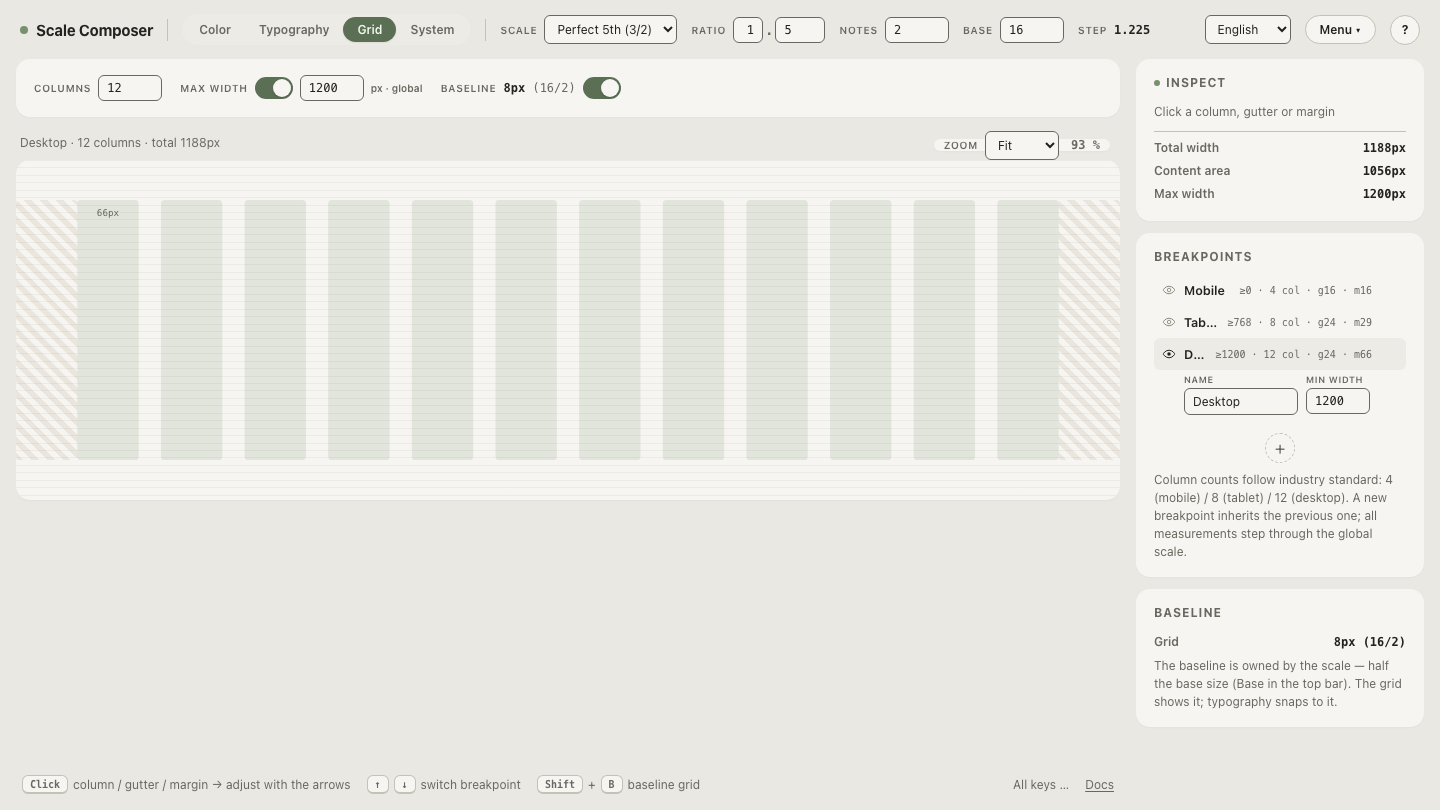
The tokens driving both patterns come from the grid system: the container cap and the per-breakpoint margins. With Scale Composer’s defaults — container 1200px, desktop margin 66px — a 1440px viewport gives the band 1440px of paint while its content spans the 1188px the grid actually totals, with (1440 − 1200) / 2 + the container’s own padding as the visual inset. Shrink to the tablet tier and the margin token drops to 29px, the band still bleeds, and the content edge follows the tier’s grid.
Open the container and its margins in the grid view — the 1200px cap with the 1440px preview around it: the zone between the container’s edge and the viewport is exactly where a full-bleed background lives.
Which elements earn the bleed?
Fewer than get it. The bleed is emphasis, and emphasis spends itself — the same budget logic as every other attention currency in a design system. The usual earners: the hero (one per page), full-width imagery and video, testimonial or CTA bands that mark act-changes in a long page, footers. The usual non-earners: body content (never), cards and tables (they read worse wide), anything mid-argument — a bleed interrupts, and interrupting the middle of a reading flow costs more than the drama pays.
Two mechanical cautions. Horizontal overflow is the classic bug: a
full-bleed element wider than the viewport (a negative-margin hack, a
forgotten width: 100vw that ignores the scrollbar) gives the whole page a
sideways scroll — prefer the grid patterns above, which can’t overflow by
construction. And text protection: content on photographic bleeds still
needs its contrast floors; a scrim
or a solid content-box under the text is
part of the pattern, not an optional extra.
Read your own margins
The bleed zone is a derived quantity — viewport minus container, split in two — and it changes at every breakpoint. Step through the tiers and watch the margin tokens change — 16px on phone (where full-bleed is barely distinguishable from contained), 29px on tablet, 66px on desktop where the band finally has room to read as a band. If your design leans on full-bleed drama, this is the number that decides how much drama each tier can actually deliver.