OLED and True Black: The Debate
Put two phones side by side in a dark room, showing the same app: one with
a near-black dark theme anchored around L ≈0.15,
one with a true-black variant
anchored at #000000. On OLED hardware the difference is physical, not
stylistic — where the true-black page shows, the pixels are switched off. The
display edge dissolves into the bezel, the content floats on nothing, and the
first impression is genuinely striking. That impression is the entire case
for #000 — and it is a real case, which is what makes this debate worth
having properly.
True black has one legitimate argument and it is hardware: on an OLED panel
a black pixel emits nothing, so a #000 theme draws measurably less power —
most pronounced at high brightness — and offers per-pixel contrast no
backlight can match. Its costs are design costs: the elevation ladder’s lower
rungs collapse into the display’s darkest values, glare peaks at
white-on-black’s 21:1, panels can smear on scroll, and the page reads as void
rather than atmosphere. The resolution most systems land on is both: near-black
as the default dark theme, true black as an optional OLED variant — a third
token mapping, not a redesign. The pieces that resolution leans on — the
anchor, the ladder, the token machinery — run through our
dark mode guide; this article takes the debate on its
merits.
What does OLED actually gain from true black?
On an OLED display each pixel emits its own light, so displaying black means switching the pixel off — the mechanics are laid out in the OLED overview. Two real benefits follow.
Power is the headline. A pixel that is off draws essentially nothing, so a true-black theme’s savings scale with how much of the screen is black and how bright the display is driven — measurable in practice, most pronounced at high brightness, and close to negligible on LCD, where the backlight burns on behind every “black” pixel regardless. Contrast is the quieter benefit: against a pixel emitting nothing, the panel’s contrast is limited only by reflected room light, which is why OLED blacks look bottomless in a dim room.
The pattern has a shipped form: some products offer a third theme alongside
light and dark — names like “lights out” or “AMOLED black” — rather than
making #000 their only dark mode. That framing, true black as an option,
is where this article ends up; the costs below are why.
What happens to elevation on a #000 floor?
Dark themes signal elevation with lightness —
surfaces step lighter as they
rise from the page. From a near-black anchor the ladder has room; from #000
the same arithmetic walks straight into the floor. Here is a four-level
ladder built both ways, with the same whisper of brand chroma and the same
≈0.04 L steps:
| Level | Near-black theme | True-black theme |
|---|---|---|
| page | L ≈0.15 — ≈#070B14 | L 0 — #000000 |
| card | L ≈0.19 — ≈#0F141D | L ≈0.04 — ≈#000001 |
| raised | L ≈0.23 — ≈#181D26 | L ≈0.08 — ≈#010205 |
| dialog | L ≈0.27 — ≈#212730 | L ≈0.12 — ≈#03060D |
The right column measures the same gaps on paper and has almost nothing to show for them on glass. The card renders one display step above the page — at this depth the tint all but clips away — and the dialog’s brightest channel is 13 of 255. The lightness arithmetic that is honest at L 0.15 stops being honest near zero: the ≈0.02 just-noticeable-difference threshold assumes the mid range, and down here the display runs out of code values before the math runs out of numbers — in exactly the register where panels crush detail and ambient reflection eats what remains.
The escape is to start the surfaces higher — a card at L ≈0.13, where rendering is reliable — but that concedes most of the case: every lit surface pays the power cost after all, only the void between content stays off, and the first step up from the floor becomes a ≈0.13 cliff instead of a ladder rung. Either way, the same four levels squeeze into less usable span than the near-black theme gives them.
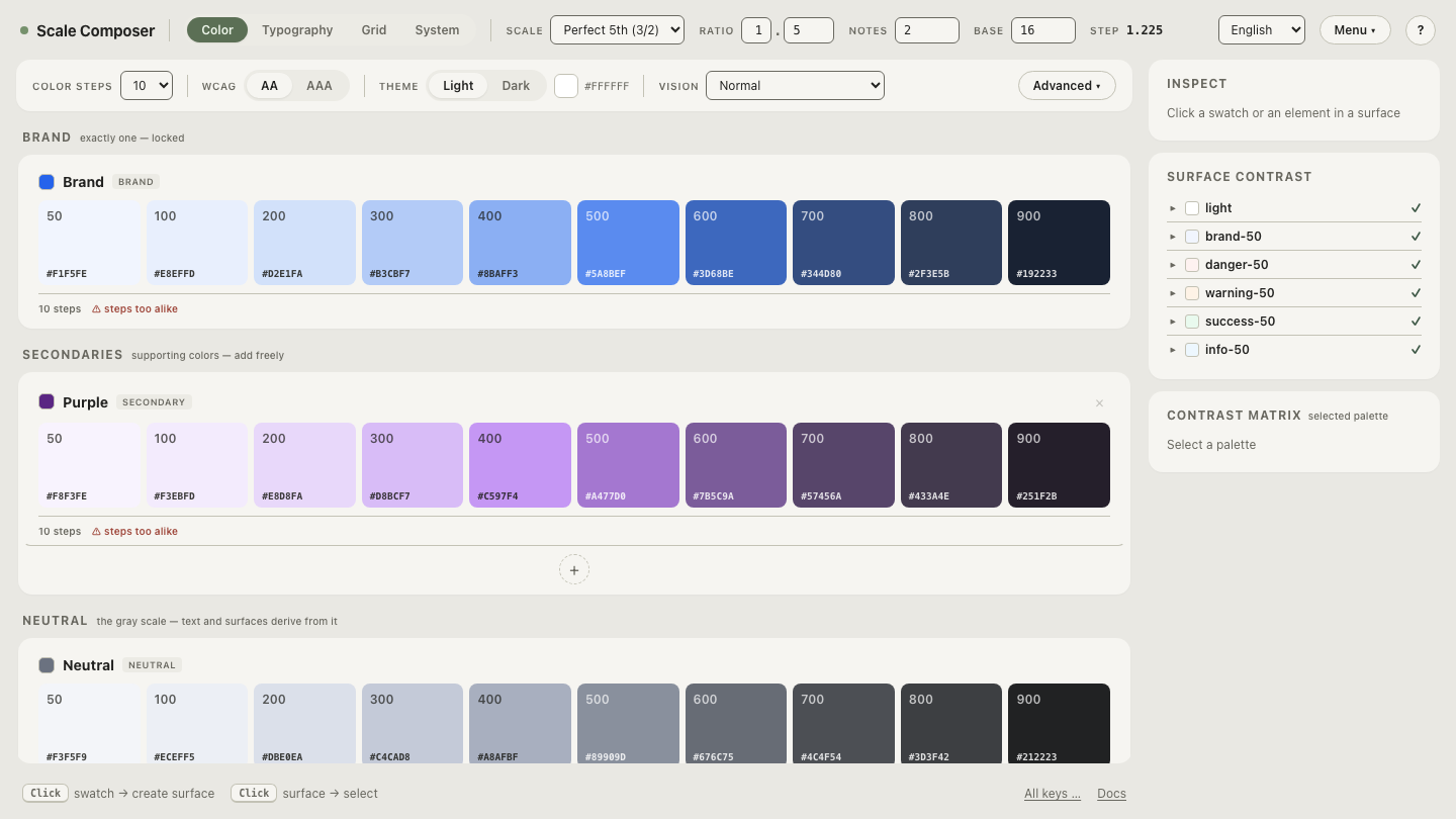
Open the near-black ladder in Scale Composer — four surface levels above an L ≈0.15 anchor, each gap measured against the 0.02 warning threshold, with the hex value each rung actually renders to.
What is black smear?
An OLED pixel switching on from fully off responds more slowly than one that
is already lit, and the lag is visible in motion: scroll gray text over a
#000 page and the pixels along the trailing edge can briefly ghost — the
artifact users report as black smear. It is most commonly reported on older
and cheaper panels, and it is specific to the transition from off; a
near-black theme sidesteps it by never letting pixels switch fully off in the
first place. A true-black theme lives on that transition —
near-dark content over pixel-off black — which is why the complaint clusters
around #000 interfaces.
Is white text on pure black harder to read?
It is the strongest glare pairing the arithmetic allows — 21:1, the maximum
the WCAG formula can produce — and the surplus arrives as bloom: bright
strokes radiating into a field that gives them nothing to push against. The
standard remedy, off-white text around L ≈0.9, still applies on #000 and
still helps; but the pairing has two ends, and true black holds the bottom
end at its extreme permanently.
There is also the cost that never shows up in a measurement. A tinted
near-black reads as atmosphere — a space the interface inhabits — while
#000 reads as absence, and on OLED it literally is: the interface becomes
gray shapes floating on switched-off glass. Some products want precisely that
starkness. It is a legitimate aesthetic; it is not a neutral default.
Should you ship true black as a second dark theme?
As a variant, not as the dark theme — that is the resolution the trade-offs point to. Near-black stays the default: it keeps the elevation ladder, avoids the smear transition, and holds glare below the maximum. True black ships as an opt-in for OLED users who want the power savings and the look — a battery- saver theme, named as such.
The token machinery is what makes the third mode cheap.
Semantic roles are theme-blind —
components reference background, surface, text-primary
and never ask which theme is on — so a true-black variant is one more value
set under the same role names, the same structure Scale Composer’s export
already carries light and dark side by side. Cheap is not free: the variant’s
values deserve the same discipline as the dark theme’s — roles re-derived
against the #000 floor, contrast floors re-checked, and a deliberate answer
for elevation, which in true-black themes often means accepting a flatter
stack and letting hairline borders carry the boundaries the ladder no longer
can.
Price the trade on your own palette
The debate settles fastest with your own values on the screen.
Re-anchor a dark palette at pure black — decouple the page
anchor from the brand’s deep step, drop it to #000000, and watch what the
ladder’s rungs render to as the floor goes to zero, before deciding whether
true black is your default or your variant.