Never Pure Black: Choosing Dark Backgrounds
A dark mode background should almost never be pure black. The working range for a page background sits around L ≈ 0.13–0.18 in OKLCH — deep enough to be unmistakably dark, high enough to leave room for the surfaces stacked above it — and it often works best as a near-black tinted with a whisper of the brand hue rather than a pure neutral. Pure black fails for three reasons: it leaves the elevation system no floor to stand on, it produces halation under light text, and it reads as void rather than atmosphere.
The background is dark mode’s most consequential single value. Every surface, border and letter in the theme is read against it, the elevation ladder is anchored to it, and its temperature decides whether the dark theme feels like the same brand or a different product. That is why our dark mode guide treats the page anchor as the first decision of the theme, not a detail — and why this article spends its whole length on one color.
Why not #000?
Elevation needs room below the surfaces. A useful analogy comes from the theatre: the stage must sit below the actors, or nobody reads who is standing where. In a dark theme the page background is the stage — the reference every raised surface is judged against — and the judging is done by lightness, because dark themes signal height by getting lighter with elevation. Anchor the page at absolute zero and the stage is jammed against the floor of the range: every card, sheet and dialog must fit its distinct level into the crushed bottom of the scale, and nothing — not an inset well, not a pressed state, not a recessed panel — can ever sit below the page, because there is no below. An anchor at L ≈ 0.15 keeps depth in reserve on both sides.
Halation. Pure white text on pure black is the maximum-contrast pairing, and for many readers it is also the least comfortable: the bright strokes appear to bloom or ghost against the black field, an effect commonly reported as worse for readers with astigmatism. The optics behind the name are described under halation — light spreading beyond its boundary — and the practical remedy in interface work is to soften both ends: a near-black ground under an off-white text color, which preserves ample contrast while taking the shimmer out of the strokes.
Depth. A deep near-black with a hint of hue tends to read as atmosphere
— a space the interface inhabits. Flat #000 tends to read as absence: a
hole in the screen on which gray rectangles float. This is the least
mechanical of the three reasons and the easiest to verify by eye; put the
same layout on both grounds and the difference in perceived depth is
immediate.
How dark should the background be?
The working range is narrow: page anchors commonly land around L ≈ 0.13–0.18.
The floor of that range is set by the problems above — push much below ≈ 0.13 and you inherit pure black’s failures by degrees, with the elevation ladder squeezed and text beginning to shimmer. The ceiling is set by identity: drift much above ≈ 0.18–0.20 and the page starts reading as a dim gray theme rather than a dark one, and the light text sitting on it starts losing comfortable contrast headroom. Within the range, the choice is less about correctness than about how much air the theme’s surface stack needs — an interface with many elevation levels benefits from anchoring at the low end so the ladder can climb further before its top rungs stop reading as dark.
Should the background be neutral or brand-tinted?
The same question light themes answer with tinted neutrals applies here, with the same logic: a gray with a whisper of the brand hue ties the stage to the palette standing on it, where an untinted gray sits apart from it. On a dark ground the effect is stronger, if anything — the background is a larger share of the pixels, and a hue-tinted near-black reads as the brand’s own darkness rather than a generic one.
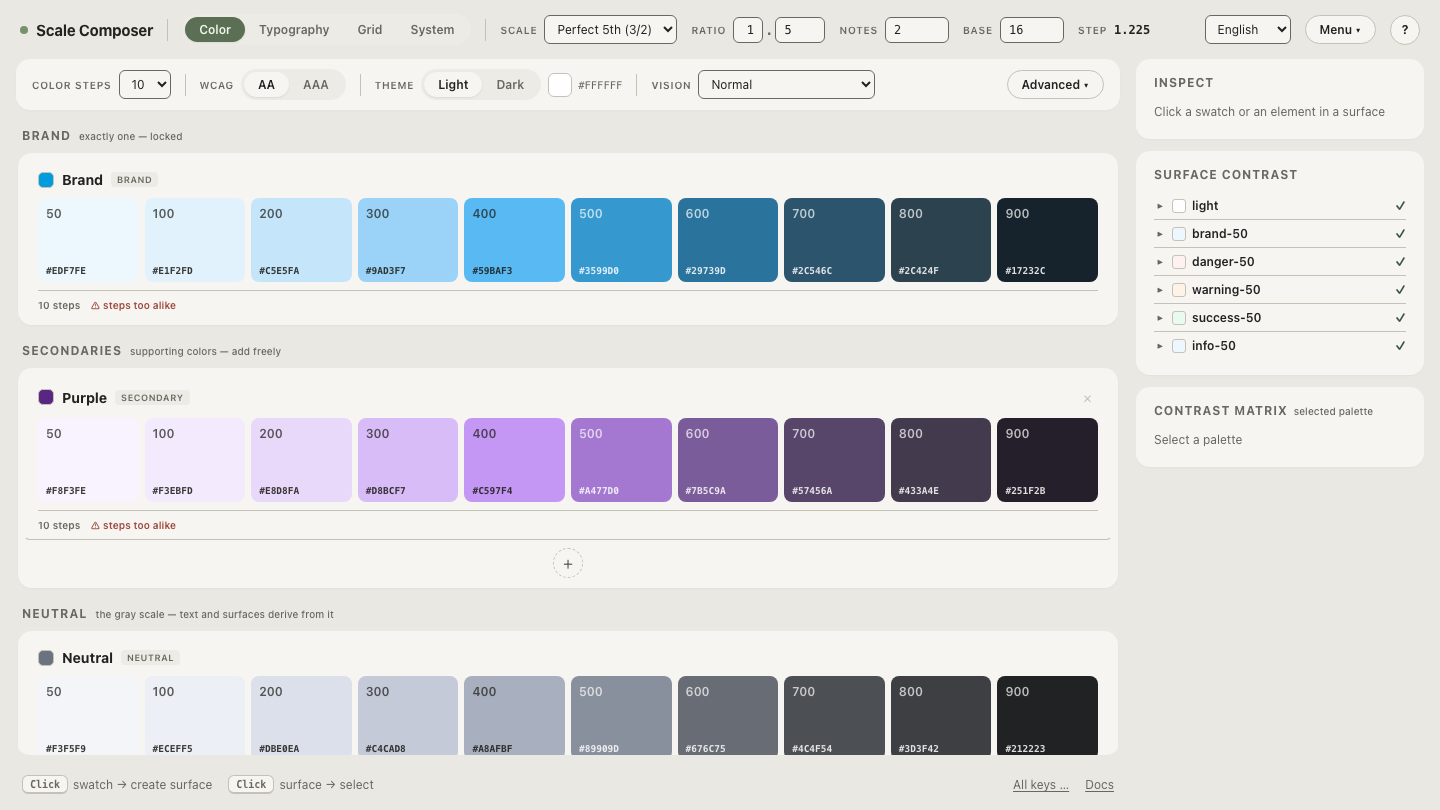
In Scale Composer this is the default wiring: the dark page anchor follows the brand’s deepest step — the brand-900-class near-black — so the theme’s floor carries the brand hue automatically, and stays coupled to it until you deliberately decouple the anchor and set it independently. Open the anchor coupling in Scale Composer — the dark page background shown following the brand’s deep step, with the hue thread visible through the whole surface stack above it.
One deliberate deferral: on OLED displays true black costs no power and some
products choose #000 for that reason with open eyes — a real trade-off
that deserves its own article rather
than a parenthesis here.
What do the three candidates look like in numbers?
Three anchors, and the elevation ladder each one allows — four surface levels separated by steps of ≈ 0.04 L, twice the ≈ 0.02 just-noticeable difference:
| Anchor | Value | Ladder it allows |
|---|---|---|
| pure black | #000000 — L 0 | ≈0.04 / ≈0.08 / ≈0.12 — the entire ladder must fit below where the other anchors start, in the crushed end of the range where adjacent levels are hardest to tell apart |
| neutral near-black | oklch(0.15 0 0) ≈#0B0B0B | ≈0.19 / ≈0.23 / ≈0.27 — ≈#141414 / ≈#1D1D1D / ≈#262626, a full ladder with comfortable gaps |
| brand-tinted near-black | oklch(0.15 0.02 262.9) ≈#070B14 | ≈0.19 / ≈0.23 / ≈0.27 at the same whisper chroma — ≈#0F141D / ≈#181D26 / ≈#212730, the same ladder with the brand hue threaded through every level |
The middle and bottom rows differ by one decision — chroma 0 versus chroma
0.02 at the same hue as the brand blue #2563eb — and that whisper is
invisible in a swatch but felt across a full screen, much as tinted
neutrals behave in light mode. The top row is the cautionary one: it is not
that no ladder exists above pure black, but that it must live entirely in
the register the other two anchors reserve for depth below the stage.
Decide the anchor deliberately
The coupling that ties the page to the brand’s deep step is a default, not a doctrine — some brands want a neutral floor. Decouple the anchor and compare — the same dark theme with a brand-tinted floor and a pure neutral one, switched live, so you can judge which darkness your palette belongs on before a single token ships.