Why Every Brand Ends Up Blue (and How Not To)
Try a small experiment: open your bank’s website, then its three nearest competitors’, and put the logos side by side. Repeat for insurance, for payment apps, for developer tools, for healthcare portals. Somewhere in the exercise the individual brands dissolve into one institutional blue haze — and the few exceptions jump off the screen precisely because they are exceptions. “Every brand” overstates it; run the experiment and see how little it overstates it by.
Blue brand colors dominate through a safe-choice ratchet — blue offends nobody, committees converge on what nobody objects to, and each new blue makes the next one feel safer — reinforced by genuine functional merits: blue has deep usable ramps with contrast room at both ends, survives color-blindness comparatively well, and reads as the digital default after decades of blue links and buttons. The escape is not a reckless hue; it is a differentiated one held to the same functional bar blue clears. This essay takes both halves seriously; it belongs to our brand colors guide.
Why do so many brands choose blue?
Start with the incentives — this is an incentive story, not a conspiracy. In a committee, the winning color is usually the one with no enemies, and blue reliably has none: it carries no loud cultural baggage, alienates no demographic anyone can name, and looks at home next to the rest of the category. Each decision is locally sensible. The trouble is that the decisions compound: every additional blue in finance, tech or healthcare makes blue look a little more like “what serious companies do,” which lowers the perceived risk for the next committee, which adds another blue. A ratchet — each turn makes the previous turns harder to argue with.
There is also an asymmetry of blame. The person who proposes blue is rarely the one questioned when the brand feels forgettable; the person who proposed the plum would have been. Safe choices are safe for the chooser first.
What does blue genuinely do well?
The honest half of the story, worth admitting before criticizing the color: part of blue’s dominance is engineering, not herd behavior.
Deep, usable ramps. Blue keeps working across an unusually wide
lightness range. The working blue #2563EB carries white text at ≈5.2:1;
one step down, #1D4ED8 gives ≈6.7:1; deeper still, #1E40AF reaches
≈8.7:1 — a long runway of steps that stay recognizably blue while offering
real contrast room for buttons, states and text uses, with light tints that
stay clean rather than turning gray.
Color-vision resilience. The common red-green forms of color-blindness leave blue comparatively intact, so a blue-anchored palette tends to survive the vision simulations with less damage than most alternatives.
A learned default. Decades of hyperlinks, operating-system accents and primary buttons have taught people that blue means interactive and digital. A blue system inherits that familiarity for free.
What does blue cost in a blue category?
Camouflage. Attention and memory go to what differs from its surroundings — the intuitive engine under all of this — and marketing science’s distinctiveness tradition (Byron Sharp and colleagues) has built the formal case: brands grow with mental availability, which is bought by distinctive brand assets — the colors, marks and shapes that let a buyer find you without thinking. An asset the whole category shares identifies the category, not you. The nineteenth blue in finance still collects blue’s trust associations; it just pays for them by being unfindable in the lineup the customer actually sees, which is a lineup full of blue.
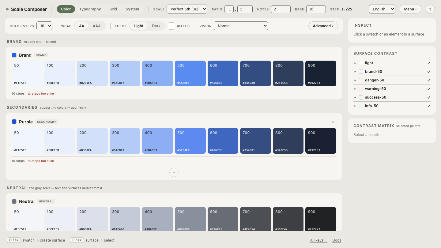
Line up several blue seeds in Scale Composer — near-neighbor blues each derived into a full palette, side by side. How interchangeable the resulting systems look is the cost, made visible.
How do you avoid blue without being reckless?
By holding the alternative to the bar blue clears, not by lowering it. The functional tests are the same three the choosing process runs anyway: contrast room for text-bearing fills, darker neighbors for states, and survival under the color-vision simulations. Some alternatives pass with ease:
| Candidate | White text on core | As a sole primary |
|---|---|---|
Deep green #047857 | ≈5.5:1 | passes — full state room below |
Teal #0F766E | ≈5.5:1 | passes — calm, still uncommon in many categories |
Plum #7C3AED | ≈5.7:1 | passes — deep ramp, distinctive in most lineups |
Vivid yellow #FACC15 | ≈1.5:1 | fails — works as accent or with a dark-text identity |
Bright orange #F97316 | ≈2.8:1 | fails as-is — needs a darker interactive tier |
Two cautions keep the move honest. Greens earn extra scrutiny under the red-green forms of color-blindness — run the simulation rather than assume. And the failing rows are not banished colors; they are colors that commit you to extra structure (a darker functional tier, a dark-text identity) that the passing rows don’t require.
What is the two-color hedge?
The pattern that lets identity be brave while the system stays conservative: give the differentiated hue the identity moments — logo, hero surfaces, the recognizable accent — and keep a conventional functional layer underneath. Success stays green, errors stay red, neutrals stay calm, and interactive semantics can stay familiar. Users don’t need the whole interface to be plum; they need to find you in the lineup, and one distinctive asset repeated with discipline does that work. The hedge also shrinks the internal argument: nobody has to defend plum error states, because there aren’t any.
Put a non-blue candidate through blue’s own test
The experiment that opened this essay has a constructive second half: take a differentiated hue and derive the full system from it — ramp, states, text pairings against their floors, the dark palette, the color-vision check. If the candidate clears the bar blue clears, the safest argument for blue is gone; what remains is a choice between being safe and being seen.