Multi-Brand Token Architecture
One product serving several brands — a house of brands, a white-label platform, a portfolio of acquisitions — is a token-layering problem: keep one shared semantic layer (the role vocabulary every brand fills), give each brand its own primitive layer (its seed color and the ramps derived from it), and let components consume only the semantic layer. Switching brands then becomes a primitive-set swap that touches zero components.
The mechanics are the same as light-and-dark theming, one level up: a dark theme is a second set of answers behind the same roles, and a second brand is the same move with a different seed. This article — part of our brand colors guide — covers the layering, the worked two-brand example, what must be tested per brand rather than assumed, and the governance question underneath it all.
What does the layered architecture look like?
Three layers, with strict traffic rules between them:
components         →   semantic roles    →   primitives (per brand)
button fill            accent                brand A: blue-600  |  brand B: green-700
button label           on-accent             brand A: white     |  brand B: white
page background        background            brand A: cool white|  brand B: green-tinted white
Primitives are per brand:
each brand’s seed generates its own ramps
— the brand color’s tints and shades, a neutral scale tinted from the same
seed, the functional colors. Semantics are shared: background,
surface, text-primary, border, accent, on-accent and their
siblings form one role vocabulary that every brand must fill. Components
consume only semantics — a button knows it is filled with accent, never
that accent is currently a particular blue.
The intuition for why this works: components ask a fixed list of questions — what color is a page background here? what color is text on an accent fill? — and a brand is simply a complete set of answers. As long as the question list is fixed and every brand answers all of it, any number of brands can sit behind the same product, and adding one requires writing answers, not rewriting askers.
What does a brand switch actually change?
Only the primitive set. Here are two brands filling the same six semantic slots — brand A seeded from a blue, brand B from a green:
| Semantic role | Brand A (seed #2563eb) | Brand B (seed #16a34a) |
|---|---|---|
background | ≈#f8fafc (cool-tinted white) | ≈#f6faf7 (green-tinted white) |
surface | #ffffff | #ffffff |
text-primary | ≈#0f172a | ≈#13201a |
border | ≈#e2e8f0 | ≈#dcebe0 |
accent | #2563eb — the seed itself | #15803d — one step deeper than the seed |
on-accent | #ffffff (≈5.2:1) | #ffffff (≈5.0:1) |
Five of the six rows are exactly what you would expect: the tinted neutrals
lean toward each brand’s hue, the text ink and borders follow. The accent
row is the gotcha.
Brand A’s seed can be the accent: white text on #2563eb measures ≈5.2:1,
comfortably above the 4.5:1 floor for normal text. Brand B’s seed cannot:
green at the same nominal position is a lighter color — #16a34a sits at
≈0.63 OKLCH lightness against the blue’s ≈0.55 — and white on it measures
only ≈3.3:1. The same role, mapped the same naive way, passes in brand A and
fails in brand B. The fix is per-brand mapping: brand B’s accent points one
step deeper in its own ramp (#15803d, ≈5.0:1 with white), or alternatively
keeps the seed as fill and flips on-accent to a dark ink. Either is
legitimate; assuming the mapping transfers between brands is not.
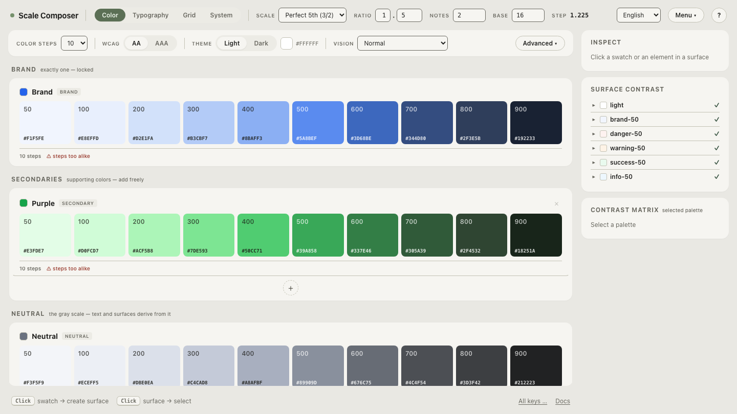
Open two brands filling the same role structure in the Scale Composer — the blue brand’s token values imported, the green system derived from its own seed alongside them, and the contrast checks showing exactly where the green brand’s mapping has to differ.
What must be tested per brand rather than assumed?
Three things, all variations of the gotcha above:
- Contrast, per brand, per pairing. Every fill role must meet the floors with its own on-colors. A seed’s lightness decides which ramp steps can hold white text, and seeds differ — so the role-to-step mapping is a per-brand decision verified against the floors, never copied across.
- Functional colors, tuned to the brand. Success, warning, error and info need per-brand attention on two axes. Chroma level: a muted brand whose palette whispers gets shouted over by a full-chroma error red, while a vivid brand needs stronger functional colors to register as system rather than more brand. And collision: for the green-seeded brand above, a default success green sits dangerously close to the brand color itself — it needs to be pushed apart until the two are readable as different messages.
- Dark variants, derived per brand. A dark palette is derived from a seed, and each brand has its own — sharing one dark theme across brands quietly discards the brand tinting that made each palette cohere in the first place.
Who owns the role vocabulary?
The organization, not any single brand — because the shared role vocabulary is the real asset. Brands come and go: acquisitions arrive with palettes of their own, white-label clients churn, sub-brands get retired. The roles persist through all of it, and they are what makes the next brand cheap to add.
That is why role discipline matters more than any individual color decision. Adding a role because one brand’s campaign wants a special gradient slot pollutes every brand: each must now answer a question only one of them asked, and every component may start consuming the answer. A new role should enter the vocabulary only when the underlying UI need exists across brands; anything narrower belongs inside one brand’s primitive set, where it can die with that brand instead of outliving it.
How do you see the swap for yourself?
By holding the structure still and changing only the seed. Swap the primitive set behind a fixed role structure — re-seed the palette, watch every role re-fill from the new ramps, and check which role-to-step mappings the contrast floors force to move.