Primitive, Semantic, Component: The Three Token Layers
“The rebrand was scoped at three days. It took three weeks.” The post-mortem behind that sentence tends to be the same: the old brand color existed as raw hex, pasted into hundreds of components, so “swap the blue for the teal” was not one change — it was a find-and-replace across the codebase, plus a review of every place the replace guessed wrong. Nothing was misbuilt; there was simply no layer where “the brand color” existed as a single decision.
Token architecture prevents exactly this, with up to three layers.
Primitive tokens are the raw vocabulary — brand-600, space-4,
text-lg — values with positional names and no opinion about use.
Semantic design tokens are the decisions — background, text-primary,
accent, gap-section — role names that point at primitives; this is
where design intent lives. Component tokens — button-bg pointing at
accent — are an optional third layer for the cases where one component
must detach from a semantic default. Components read the semantic layer,
and the common changes — rebrand, theme, exception — each land in one
layer. The general token
concept has its own article in our
design tokens guide; this one is about the layer
model itself.
What does each layer do?
Primitives are the palette and the scales: brand-50 through
brand-900, space-1 through space-7, text-sm through text-xl.
Their names state a position, never a purpose —
brand-600 tells you
which blue, and deliberately nothing about where it belongs. They are the
system’s vocabulary: everything sayable, nothing yet said.
Semantic tokens say things. background → neutral-50,
text-primary → neutral-800, accent → brand-600,
gap-section → space-7: each is a
design decision — this role
is played by that value — recorded as a reference. When someone asks where a
product’s design intent is written down, this layer is the answer.
Component tokens record exceptions. button-bg normally has no
reason to exist — the button can read accent directly. It earns its
place the day the button must stop following accent: a marketing theme
re-points accent to a secondary hue, but the primary button needs to
stay on brand. The component token records that detachment.
Material Design’s token system documents the same three-tier architecture — reference, system and component tokens — in its design tokens overview, under different layer names.
Which rules make the layers work?
Three rules, each protecting a different property:
- Components consume semantics, never primitives. A component that
reads
brand-600has hard-coded an assumption about which step does which job today; a component that readsaccentstates a need and lets the system answer it. This rule is what makes rebrands and themes cheap — break it and the layer above the break stops protecting you. - Semantics point down, one hop. A semantic token references a
primitive, not another semantic token. Chains like
button-text → text-inverse → on-dark → neutral-50read as flexibility but cost navigability: nobody can resolve a value without spelunking. One hop keeps every role answerable in a single lookup. - Primitives reference nothing. They are the floor. Every trace, followed downward, terminates in a primitive holding a literal value — which is what makes traces finite and files debuggable.
Why do layers beat a flat token list?
Because of what each change costs. In a layered system, the three common changes each touch one layer:
| Change | Layer touched | What happens |
|---|---|---|
| Rebrand | primitives | brand-600 stores a new value; accent and every component above it hold |
| New theme | semantics | the same role names get a second mapping — dark values for background, accent, the rest |
| Component exception | component | button-bg detaches from accent; nothing else notices |
In a flat list — or worse, raw values in components — every one of these
becomes the three-week rebrand from the opening: a find-and-replace across
everything, with judgment calls at each hit, because the same #2563eb
that meant “brand” in one file meant “link color that happens to match” in
another.
The intuitive why is worth declaring as the programming parallel it is: layers are indirection, and indirection is how software has always contained change — the same reason code calls functions instead of repeating their bodies. A semantic token is an interface; primitives are the implementation; and changes stop propagating at the boundary between them. Design systems did not invent the trick, they inherited it.
What does a full trace look like?
Downward, from a component: button.background reads {semantic.accent};
accent reads {color.brand.600}; brand-600 stores #2563eb, which is
oklch(0.546 0.215 262.9). Three hops, each one a separable decision. The
same shape holds outside color: gap-section reads {spacing.7}, which
stores 64px.
Upward, from a value: #2563eb is stored exactly once, at brand-600.
One semantic role points at it — accent. Ask what consumes accent and
you have the complete blast radius of changing the brand color: the
button, links, the active nav state — a finite, listable set, instead of
“wherever the hex was pasted”.
Open the trace view in Scale Composer — the primitive ramps and scales on one side, the semantic roles pointing into them, and any role’s chain readable hop by hop down to the stored value.
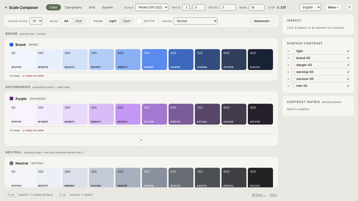
Now the rebrand test, the layered system’s proof: re-derive the palette
from a teal seed. brand-600 keeps its name and changes its stored value.
accent still says {color.brand.600} — as a statement, it is untouched
and still true. button.background still says {semantic.accent}. The
change happened in one layer, and the layers above it did not move. That
is the three-week rebrand reduced to its honest size: one edit and a
review.
When is it honest to skip a layer?
The component layer, often. A small product with disciplined semantics
rarely has detachment cases, and component tokens created in advance of
need are indirection without meaning — button-bg → accent → brand-600,
three names for one value that never varies independently, multiplied
across a component library until nobody can navigate the set. The layer
earns its place at design-system scale, when real exceptions appear — a
reasonable default is to introduce each component token with the exception
that justifies it, not before.
The semantic layer is the one to keep even when small. Primitives-only
means components fossilize assumptions (brand-600 meaning “button
color” in a hundred places), which is the opening story with better
names. Primitives plus semantics is the honest minimum for a system that
expects to survive a rebrand or
grow a dark theme.
Run the rebrand test yourself
The layer model is easiest to trust after watching a change stop at a boundary. Swap the seed and watch the layers work — the primitive ramp re-derives, the semantic roles re-point automatically and keep their names, and the trace from the button downward still resolves — same statements, new answers, no find-and-replace.