When Your Brand Color Fails Accessibility
The audit report lands, and one line lands hardest: the brand orange fails contrast on buttons. Design proposes darkening it. Marketing hears “change the brand” and refuses — the orange took years and a real budget to build, and it is the brand. Both sides are doing their jobs, and the meeting ends where these meetings usually end: nowhere.
The standoff rests on a false choice, because recognition lives mostly in the hue, not in the exact value — a one-step-darker orange is still the orange. The resolution most systems land on is two-tier: a darker step of the same hue for buttons and other text-bearing uses, with the vivid original kept for hero moments and large graphics. Genuinely re-choosing the color is a rare last resort. This article walks that decision tree; it is part of our brand colors guide.
What did the audit actually measure?
The label against the fill it sits on — nothing about the color in
isolation. The floors come from
WCAG’s contrast minimum:
4.5:1 for text at ordinary sizes, 3:1 for large text and graphical objects.
A vivid brand orange like #F97316 carries white text at ≈2.8:1 — well
short of both floors at button-label sizes — which is a measurement, not an
opinion, and no amount of brand affection moves it. (How systems then
derive the text color per fill,
with hard floors and fallbacks, is its own mechanic; here it is enough
that the failure is deterministic.)
The legal weight has grown too: WCAG AA is the common reference point in the era of the EU’s accessibility legislation, so “our brand is an exception” is a harder position than it used to be. That context tends to end the whether debate. What remains — the productive part — is how.
Does a darker orange stop being the brand?
This is the reframe that resolves most standoffs: what people recognize is narrower than teams assume. Recognition research generally points at the hue in its role — “the orange one” — rather than at an exact coordinate; memory for a color’s precise lightness is loose, which is also how several major brands have quietly darkened their working values over the years without anyone outside the design team noticing.
The numbers make the case concrete. Take the failing orange #F97316 and
step it down its own ramp to
≈#C2410C: white-text contrast moves from
≈2.8:1 to ≈5.2:1 — failure to comfortable pass — while the hue shifts only
about nine degrees on the color wheel. Lightness did all the compliance
work; the orange-ness barely moved. Nobody describes a brand as “the
lightness-0.7 orange.” They say the orange one, and it still is.
What is the two-tier solution?
The first and usually final branch of the decision tree: split the color’s duties. Brand moments — hero surfaces, packaging, large graphics — keep the vivid original. Functional moments — buttons, links, badges, anything carrying body-size text — use a darker step of the same hue. For the orange above:
| Value | White text | Verdict | Job |
|---|---|---|---|
#F97316 — the original | ≈2.8:1 | fails text floors | heroes, illustration, large graphics |
#EA580C — one step darker | ≈3.6:1 | large text only (3:1) | oversized headlines on fills |
#C2410C — two steps darker | ≈5.2:1 | body text (4.5:1) | buttons, links, badges |
One honest note from the table: “one step darker” resolves this for many brands, but this particular orange needs two steps to clear the body-text floor — which is exactly why the fix is measured on your color rather than copied from an article.
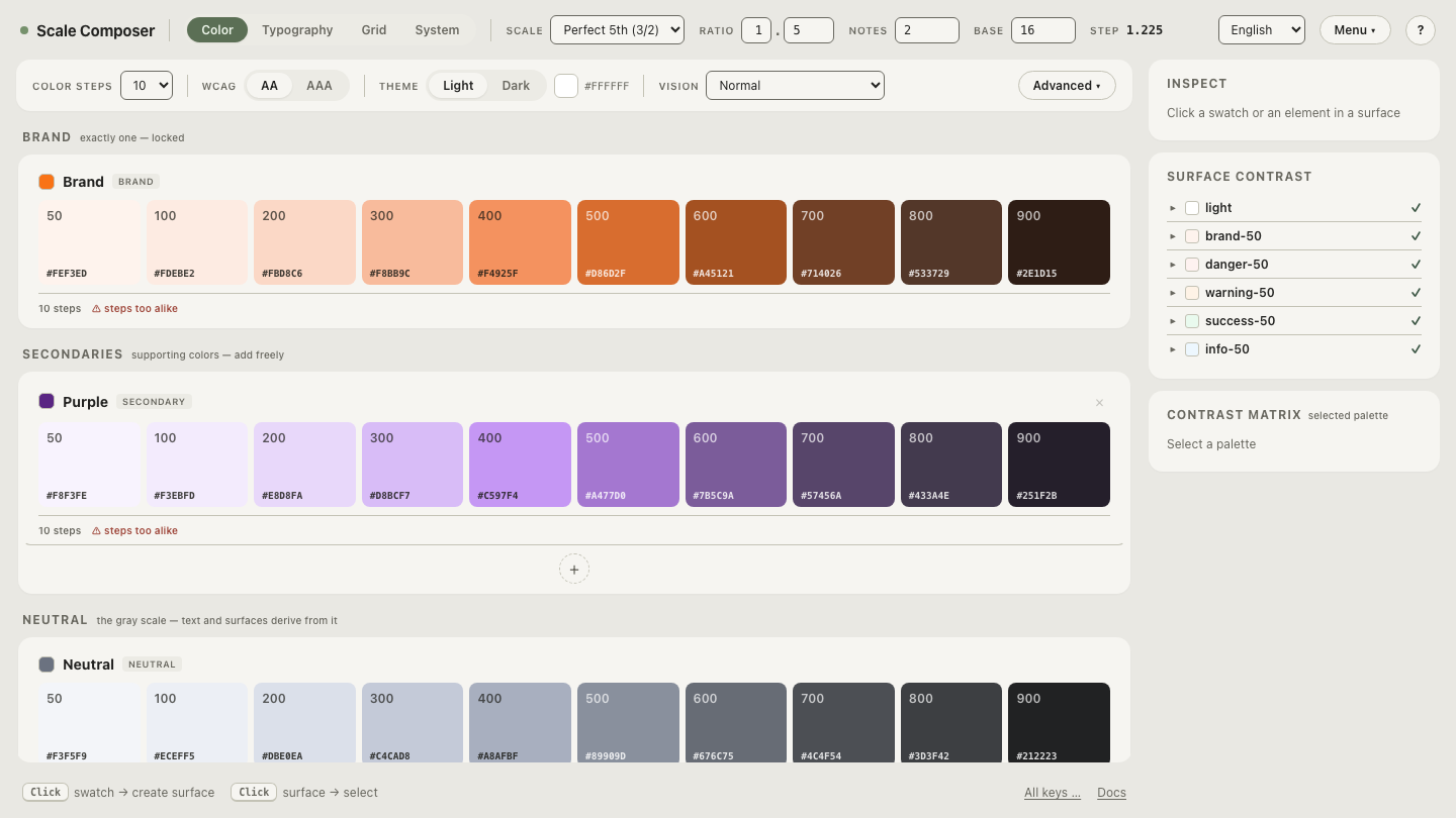
Open this orange’s contrast panel in Scale Composer — the vivid original and its darker steps with their white-text ratios against the 4.5:1 and 3:1 floors, and APCA values alongside as a second opinion.
When is the vivid original still allowed?
More often than the audit’s tone suggests. The 3:1 floor covers large text and graphical objects, so the vivid orange remains legitimate for oversized headlines sitting on it, for icons and data marks against light backgrounds, and for any hero surface where the text sits on a white card rather than on the orange itself. The two-tier system is not a demotion — the vivid orange keeps the most visible, most photographed, most brand surfaces. What it gives up is the right to sit directly under small text.
When does the color genuinely have to change?
Rarely — the third branch exists for hues with no usable dark step. A vivid yellow is the standard example: by the time white text passes on it, the color reads as bronze, so there is no “same hue, one step darker” to retreat to. Even then the first alternative is usually not a new hue but a flipped text identity — dark text on the vivid color, which passes easily — and only a brand whose identity truly depends on white-on-color has to reopen the choice itself. If you reach this branch, treat it as choosing a color again from the start, with the stress test that would have caught the problem the first time.
How do you get the organization to say yes?
Show, don’t argue. The two-tier proposal loses in the abstract — “darken the brand color” sounds like loss — and tends to win on screen, where the feared outcome simply fails to appear: the hero is still vivid, the button is still orange, and the pair no longer fails the audit. Put both tiers side by side in front of the people who care most about the color, and let them look for the damage. Open the two-tier fix and see both tiers side by side — the vivid original in its hero role, the darker step under white text with its passing ratio — and send the shareable link to whoever still needs convincing. The conversation gets much shorter when the thing itself is on the table.