AI Color Palette Generators: Where They Work and Where Math Takes Over
Ask an AI palette generator for “warm, grounded colors for an outdoor brand” and it delivers something genuinely useful: five or six colors that share a temperature, a mood you can react to in seconds, often even names — clay, moss, dune. Now ask it a different kind of question: does this text color clear the contrast minimum on that background, and do these five greens sit at even perceptual intervals? It will answer just as confidently. But the two questions belong to different kinds of work, and only the first is on the generator’s home turf.
An AI color palette generator is reliable where palette work is a sampling task — direction, mood, naming — and unreliable where it is a computation task: contrast floors, perceptually even steps, and systematic derivation. The productive workflow is not choosing between the two but splitting the job: AI for the direction, math for the system.
This article — part of our guide to AI and design systems — walks that boundary line.
What does an AI palette generator do well?
A model trained on an enormous corpus of interfaces, photographs, film stills and brand sites carries a well-formed sense of which colors tend to appear together and what moods they signal. Asking it for a palette taps exactly that: it samples from the space of combinations that have worked before. For finding a direction, this is a real strength — it compresses what used to be days of mood-boarding into minutes, and it produces candidates concrete enough to disagree with, which is often how direction actually gets found. Reacting to a nearly-right palette is far easier than inventing one from a blank page.
The naming is a quieter strength with practical value: a palette that arrives as terracotta, sage, sand rather than three hex codes gives a team a shared vocabulary, and gives image-generation prompts something far more reliable to hold onto than a lone hex value.
What can a generated palette not guarantee?
A shipping interface needs three properties from its colors, and each is a property of computed numbers rather than of taste:
- A contrast floor. Every text-on-background pairing the UI will actually produce has to meet a minimum ratio — not most pairings, every pairing.
- Even steps. A five-color mood palette has no steps at all; a working UI typically needs around ten shades per hue — for hover and pressed states, borders, subtle surfaces — and those shades should advance by uniform perceptual increments, or the middle of the ramp will look bunched while the ends look stretched.
- Systematic derivation. Every value should be traceable to a seed plus a rule, so that changing the seed regenerates the whole system instead of orphaning forty hand-adjusted hex codes.
A sampled palette can happen to satisfy any of these. It cannot promise them, because nothing in the sampling process computes them — the model is drawing from what looks right, and all three properties are defined by arithmetic, not appearance. Our article on why AI-generated interfaces drift off-brand covers what that sampling behavior does to consistency over time; the same logic applies inside a single palette.
Why is contrast a calculation rather than a judgment?
The WCAG contrast ratio is defined as arithmetic on relative luminance — a number computed from a color’s RGB components through a fixed formula. Body text needs 4.5:1 against its background; either the two numbers produce that ratio or they don’t. Nothing aesthetic enters the definition, and the eye is a poor estimator of it: mid-tone pairings that look comfortable routinely fail, and some pairings that pass look worse than ones that don’t.
So when a generated palette arrives with a claim like “accessible color combinations,” treat it as a mood-register statement about a mathematical property. The claim may be true. The only way to know is to compute it.
What does the computed half of the workflow look like?
It starts from one color — and that seed can absolutely come from an AI palette; this is exactly where the handoff belongs. From the seed, a deterministic system derives the rest: ten steps placed on a lightness curve in OKLCH, a color space built so that equal numeric steps read as equal visual steps.
Open a computed ramp built from a single seed — ten steps, each holding a name and an exact value, spaced evenly because they were placed on a curve, not picked. Drag the seed and the whole ramp follows.
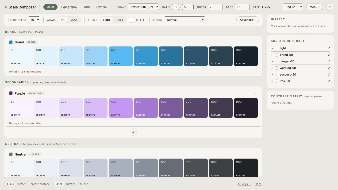
The even spacing is not a stylistic preference. It is what makes the ramp usable as a system: step 300 to 400 means the same visual change as 600 to 700, so hover states, borders and surfaces built from adjacent steps behave predictably everywhere. How the curve shapes that spacing is its own topic — covered in our article on lightness curves.
How do the two halves fit together?
The split, in order:
- Direction — AI. Generate palettes until one has the right mood. Keep the vocabulary it suggests; discard the exact values without guilt.
- Ramps — computed. Feed the chosen seed into a deterministic system and derive full ramps on perceptual curves.
- Roles — derived, with a floor. Assign semantic roles — background, text, accent — from the ramp’s steps, with every pairing checked against the contrast minimum as arithmetic.
- Tokens out. Export the result as named tokens, so downstream tools — including AI coding tools — reference names instead of re-guessing values.
Notice what survives from the AI’s contribution: the direction, the mood, the names. What gets replaced is only what sampling was never going to guarantee — the numbers. The same split reappears at larger scale when you ask whether ChatGPT can build a whole design system.
See the floor, not just the ramp
The clearest way to feel the difference between a palette and a system is to look at the checked pairings: open the same ramp with semantic roles derived against the WCAG floor — background, text and accent assigned from the steps, each combination scored rather than eyeballed. The aesthetic direction stays whatever you (or your generator) chose. The guarantees are the part that’s computed.