Fixed vs Fluid Columns
Take a page you consider well built and drag the browser window slowly from wide to narrow. Watch what moves. The columns compress, absorbing every pixel you take away — but the gutters between them hold still, and so do the margins at the edges. Then, somewhere around a device-sized width, the layout snaps: twelve columns become eight, and the compression starts over from a wider column. That slow-flex-then-snap rhythm is the fixed-vs-fluid question, already answered.
In the grid model most modern layouts use, columns are fluid — 1fr
tracks that absorb viewport change — while gutters and margins stay fixed
within each breakpoint tier. A fixed vs fluid grid is therefore rarely an
all-or-nothing choice: the practical question is which of the three widths
flexes, and the common answer is only the columns.
This article covers that division of labor, the two honest alternatives at the extremes — everything fixed, everything fluid — and how fluid columns interact with breakpoints, with the numbers of one tier computed at both ends of its range. It is the design-decision layer of the layout grid; the CSS that implements it lives elsewhere in the cluster.
Which parts of a grid should flex?
A grid is three widths — columns, gutters, margins — and they earn different treatment because they do different jobs.
Gutters fixed. The gutter is rhythm: the repeated interval that makes columns read as one family. Let gutters scale with the viewport and the spacing between everything breathes unpredictably — the same two columns sit 24px apart on one screen and 31px on another, and the page’s spacing system quietly stops being a system. Spacing is close to identity: it is one of the things a reader recognizes a layout by, so it holds still.
Margins fixed per tier. The margin is the frame. A frame that grows and shrinks continuously reads as instability at the page edge; a frame that holds at 16px on phones and steps up at known widths reads as a deliberate mat around the content.
Columns fluid. Columns are where content lives, and content areas are
elastic in a way spacing is not — a paragraph is not much different to
read at 68px more width, but a gutter visibly wobbling is noticed. So the
columns take all the change: fixed members come off the top, and 1fr
tracks split whatever remains. Fluid used to mean percentage arithmetic
done by hand — column widths as hard-won decimals like 8.333%. The
fr unit
moved that arithmetic into the browser, which now runs the
leftover-division live at every viewport width.
What does a fully fixed grid look like?
The print-descended alternative: columns, gutters and margins all fixed, the whole canvas a known quantity, and the viewport’s leftover width dumped into the outer margins by centering. It is how early web layouts worked (the 960px era), and it survives where its virtues still apply — documents, reading apps, anything whose ideal is “the same page every time”. A fixed measure is genuinely good for long text: line length never drifts out of the comfortable range.
The cost is the space between breakpoints. At an 1100px viewport, a fixed 960px layout leaves 140px of dead margin that neither content nor frame uses; every viewport between two design sizes gets the smaller design plus waste. Fixed grids trade adaptation for certainty, and the trade only reads as fair where certainty is the product.
What does a fully fluid grid look like?
The opposite extreme removes the container cap entirely: columns flex at every width with no upper bound. Dashboards, tables, editors and other data-dense applications genuinely use the width — a 2560px monitor showing more columns of a log viewer is a feature, and capping it would waste the user’s most literal resource, pixels.
The costs appear when text is involved: uncapped columns mean uncapped line lengths, and controls that belong together drift apart as the space between them stretches. Whether to cap is, in one sentence, the app-vs-document axis — interfaces that use width go uncapped, pages that are read get a container — and the container’s own sizing is its own topic.
How do fluid columns interact with breakpoints?
The standard responsive rhythm is the combination of the two mechanisms: columns flex between breakpoints, column counts change at them. Within a tier, the browser re-divides the leftover width continuously; at the tier boundary, the accumulated width is re-invested in more columns and each column resets to a narrower width. Flex, snap, flex.
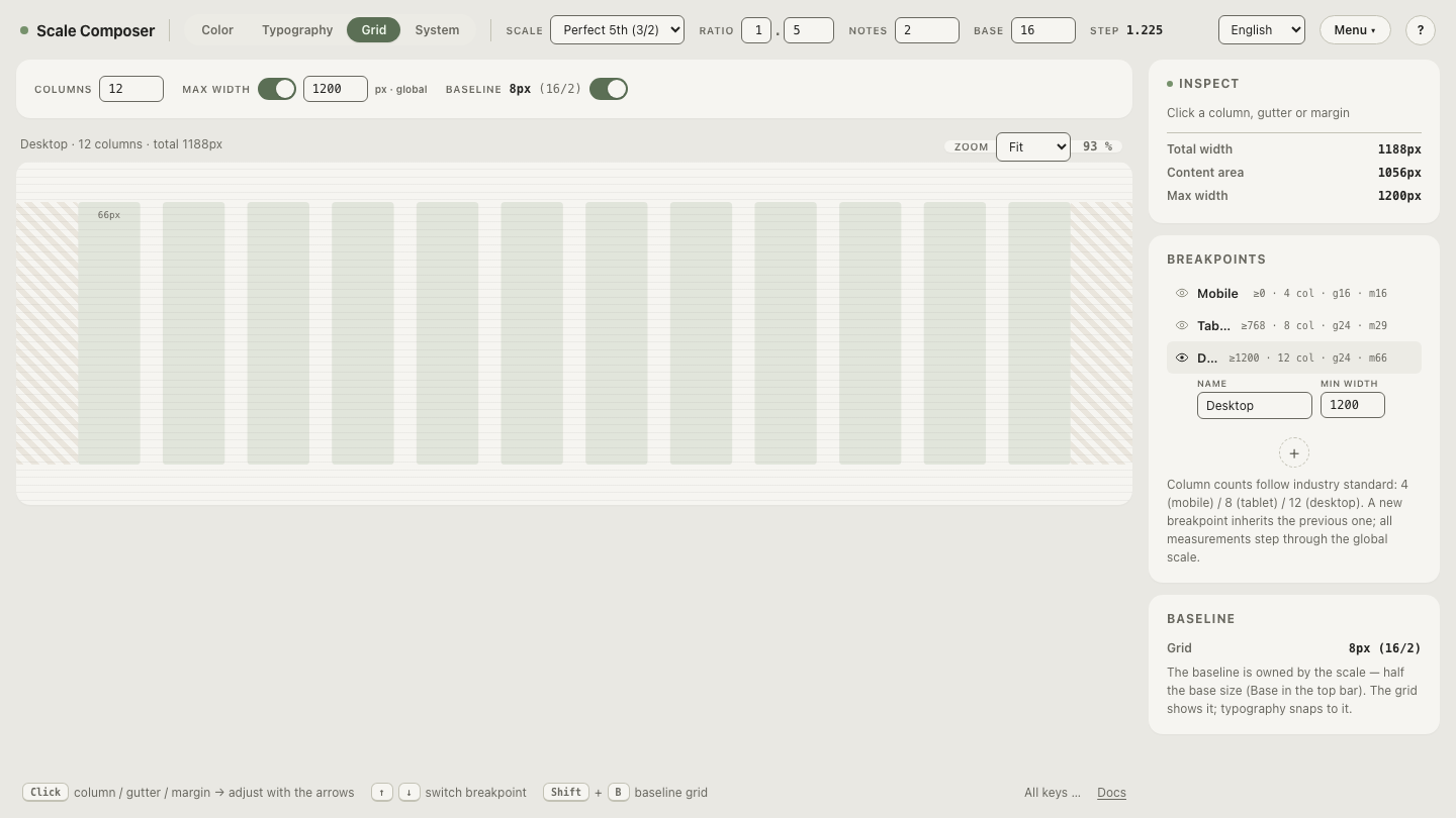
Scale Composer’s grid view makes the “between” visible because each breakpoint has two widths: the min-width where the tier begins, and a preview width you can set anywhere inside the tier’s range. The default tablet tier runs from 768px up to 1199px — every width in that band is the same eight-column grid, just with wider or narrower columns.
Resize the tablet tier across its whole range in Scale Composer — same columns, same 24px gutters, same 29px margins; only the column width moves.
How much does a column actually flex?
Take the default tablet tier — 8 columns, 24px gutters, 29px margins — and compute the column width at both ends of its 768–1199px range. The fixed members come off the top: margins 2 × 29 = 58px, gutters 7 × 24 = 168px, so the columns divide whatever the viewport leaves.
| Viewport | Fixed members | Leftover ÷ 8 | Column width |
|---|---|---|---|
| 768px | 58 + 168 = 226px | 542 ÷ 8 | ≈67.8px |
| 984px | 226px | 758 ÷ 8 | ≈94.8px |
| 1199px | 226px | 973 ÷ 8 | ≈121.6px |
| 1200px → desktop tier | 132 + 264 = 396px | 804 ÷ 12 | 67px |
A tablet column nearly doubles across its own tier — ≈67.8px to ≈121.6px — while every gutter and margin holds to the pixel. Then the desktop boundary lands and the arithmetic resets: twelve columns, wider margins, and the column width snaps back to 67px. The flex absorbs; the snap re-invests. That is the entire responsive rhythm in one table.
Turn the cap off and feel the difference
The last decision — capped document or uncapped app — is easier to make after seeing both on the same grid. The container max-width in the grid view can be disabled: with it on, the desktop tier stops growing at 1200px and the margins take over; with it off, the twelve columns keep flexing as wide as the window goes. Toggle the container cap on the same grid in Scale Composer.