Why Max Saturation Backfires in UI
Sketch the same analytics dashboard twice. In the first version, every element runs near the blue seed’s peak chroma of ≈0.22 — header bar, sidebar, KPI cards, chart series, buttons, each as vivid as the gamut will allow. In the second, only the primary action and the active nav item keep that vividness, and everything else drops to somewhere between ≈0.01 and ≈0.10. As thumbnails, the first looks livelier. At full size, three hours into a working day, the ranking reverses — and the reasons it reverses generalize to most saturated colors in UI.
Maximum saturation backfires in interfaces for four compounding reasons: adjacent high-chroma fields keep each other’s edges visually agitated, which wears on the eyes over long sessions; uniform vividness flattens hierarchy, because emphasis is relative and a signal sent from everywhere is no signal; chroma works against text readability at the contrast levels reading demands; and vivid fills sit in exactly the lightness zone where the fewest text colors pass accessibility floors. Saturation behaves like a budget — spent everywhere, it buys nothing. This article takes the four in turn and ends where the budget should actually go; the ramp machinery it leans on lives in our color scales guide.
Why does more saturation look better in the picker?
Because a swatch competes with nothing. Shown two isolated chips of the same hue, most people prefer the more vivid one — vividness reads as energy, confidence, newness — and the color picker is precisely that setting: one patch, judged alone, where every notch toward the gamut edge looks like an improvement. Call it swatch thinking.
An interface is the opposite setting: dozens of colored areas judged simultaneously, for hours, while someone tries to do something else entirely. The question that matters shifts from is this attractive? to what does this do to everything beside it? — and it is on that second question that maximum saturation starts losing.
What does high chroma everywhere do over a session?
It keeps the screen visually loud in a way the eye does not settle into. Where two saturated fields meet, each shifts the appearance of the other — an instance of the contrast effect, which in color goes by the name simultaneous contrast — so the boundary between a vivid blue panel and a vivid green chart never quite goes quiet; the edges keep a low vibration the viewer registers without naming. One such boundary is an accent. A dashboard built of them is a room where everyone is shouting: survivable for a demo, wearing for a workday. Interfaces meant for long sessions — dashboards, editors, admin tools — have the most to lose, which is why their palettes are traditionally the most restrained.
Why does uniform vividness flatten hierarchy?
Because emphasis is relative by nature. An element reads as emphasized when it carries more of something — more size, more weight, more color — than its surroundings; strip away the difference and the emphasis goes with it, regardless of the absolute values. A vivid button on a muted page is a landmark. The same button on a page where every panel matches its chroma is camouflage.
The intuition worth keeping: color spends attention, and attention is the budget. Every saturated area on screen bids for the viewer’s eye, and the bids compete — a budget spent everywhere buys nothing anywhere. The restrained dashboard from the opening spends nearly all of it on one element, which is why its single vivid action reads instantly.
Here are the two versions in numbers, using a
blue ramp generated from the seed
#2563eb — oklch(0.546 0.215 262.9):
| Element | Everything vivid (C) | Restrained budget (C) |
|---|---|---|
| Header bar | ≈0.22 | tinted neutral, ≈0.01 |
| KPI card backgrounds | as much as the gamut allows | 50–100 tints, ≈0.013–0.025 |
| Chart series | ≈0.22 each | ≈0.06–0.10 |
| Sidebar, resting items | ≈0.22 tints | neutral, ≈0.01 |
| Active nav item, primary action | ≈0.22 — two among many | ≈0.17–0.22 — the loudest thing on screen |
One row deserves a note: the “everything vivid” column is partly fiction, because near-white card backgrounds cannot hold a chroma of 0.22 — the gamut leaves almost no room for color at high lightness, so the request gets clamped to a fraction of itself. Even maximalism runs into the ceiling. The restrained column, meanwhile, is not a special invention: those are approximately the values a bell-profile ramp already produces across its light steps, with chroma reserved for the core.
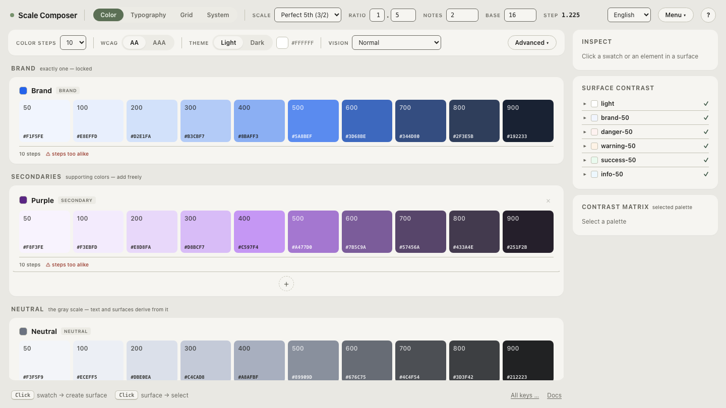
Open the restrained ramp in Scale Composer — chroma peaking at the brand core, the supporting steps carrying ≈0.01–0.10, the budget visible as a curve.
What does saturation do to text?
At reading sizes, it works against you twice.
First, directly: at the contrast levels reading demands, added chroma tends to reduce comfortable readability rather than add emphasis. This is a claim Scale Composer’s engine takes a position on — when it picks text roles, it scores candidates for sufficient contrast plus best readability rather than maximum contrast, and it applies a chroma penalty that depends on lightness: light text is penalized harder for carrying chroma, and caption roles pick the subtlest step that still passes. The restraint this article argues for is encoded in that scoring.
Second, indirectly: peak chroma is only physically available in the midtones — near white and near black the gamut allows little color — so a maximally vivid fill is also a mid-lightness fill, and mid-lightness is the worst territory for text. On a vivid 500-step fill at lightness ≈0.63, white text lands around ≈3.7:1, under the 4.5:1 floor for body-size text. Cranking saturation drags backgrounds into precisely the zone where the set of passing text colors is smallest.
What is full saturation actually for?
Punctuation. Small areas, brief moments, the one action that matters: vividness works when it is scarce, because scarcity is what makes it a signal. A useful borrowing from interior design is the 60-30-10 rule — dominant, supporting, accent — translated into chroma terms: most of the screen near-neutral at ≈0.01–0.03, supporting color around ≈0.06–0.10, and full chroma reserved for the accent tier — the primary action, the active state, the one number that changed. Transient moments can afford more than permanent fixtures: a toast at high chroma leaves before it wears; a header never leaves.
None of this argues for beige. It argues for slope — a palette that ranges from quiet to loud has a loud worth using. The fastest way to feel the difference is to destroy it: take the restrained ramp and crank every step’s chroma toward the ceiling — watch the hierarchy flatten as the budget spreads, then bring it back and see the one vivid moment start meaning something again.