Naming Color Tokens: brand-600 vs blue-600
Two token files meet the same rebrand. In the first, the palette was named
by hue — blue-600 referenced across hundreds of files. The brand turns
teal, and every option is bad: keep the name and blue-600 now stores a
teal, lying to every future reader; rename it and touch every reference in
the codebase. In the second file the same color was named brand-600. The
rebrand is one edit — the value changes, the name keeps telling the truth,
nothing downstream moves.
Color token naming works in layers — up to three. The primitive layer
names a color’s place in the palette (brand-600); the semantic layer names
UI jobs (background, text-primary, accent) and points at primitives;
the optional component layer (button-bg) exists only where a component
genuinely needs to detach from the semantics. At the primitive level,
brand-600 beats blue-600 for a single-brand palette because it names the
role a color plays, not the hue it happens to have — though hue names remain
a defensible choice for multi-hue raw palettes. What the number itself
means — the scale position behind the 600 — is covered in our
color scales guide; this article is about the words
in front of it.
Should primitives be named brand-600 or blue-600?
Both positions deserve their honest case.
The case for brand-600: a primitive’s stable fact is its position in
this product’s palette, not its wavelength. The palette has a main hue, a
set of neutrals, perhaps a secondary — those are roles, and they survive
every event in the palette’s life. Hue is the volatile property: rebrands
change it, and the opening scenario is what the name blue-600 costs when
it does. Nobody consuming a single-brand palette ever needed to know the
brand color is blue; they needed to know it is the brand color. The
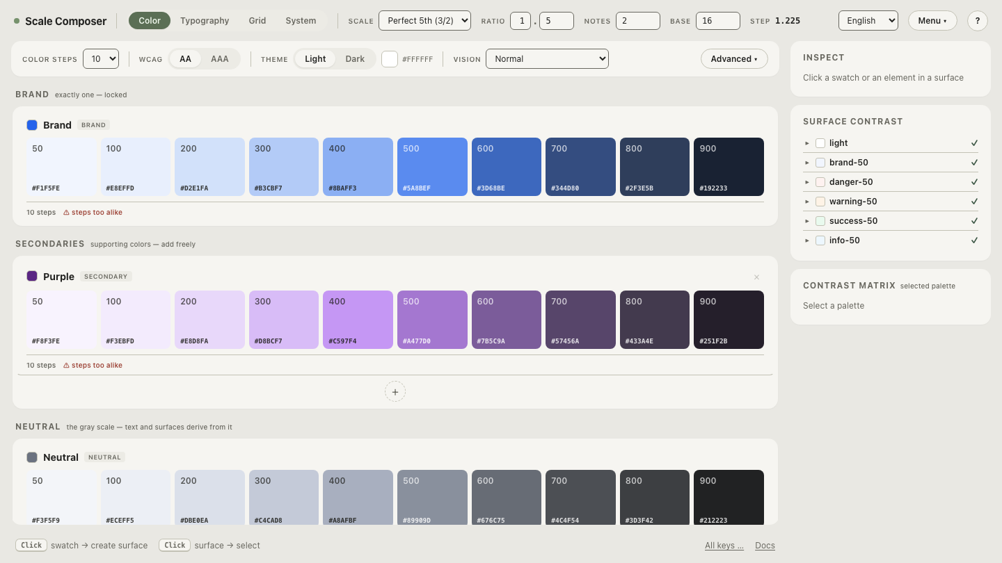
Scale Composer’s palette groups are named on exactly this principle — Brand,
Secondaries, Neutral, Functional — roles first, hues nowhere.
The case for blue-600: in a multi-hue system there may be no role to
name. A raw palette that ships twenty hues as general-purpose material —
Tailwind’s position — has no “brand” among them; hue is the only honest
name such a palette can offer, and blue-600 is exactly right there. The
same logic covers categorical chart sets, where six hues are peers with no
hierarchy to encode.
The rule of thumb falls out cleanly: if the palette belongs to one brand,
name primitives by role; if it is a crayon box serving many masters, name
them by hue. Most product design systems are the first kind and inherit the
second kind’s names by copying a framework’s conventions — which is how
blue-600 ends up lying after a rebrand nobody planned for.
What does the semantic layer add?
Indirection with meaning. Semantic tokens name jobs — background,
surface, border, text-primary, text-secondary, accent, the
interactive state colors — and each one points at a primitive. Components
consume semantic tokens and never touch primitives directly.
The payoff is that meaning and value become independently changeable. A
component written against text-primary works on any theme, because the
name promises a job, not a value; a component written against brand-900
has hard-coded an assumption about which step happens to do that job today.
The layer is also where accessibility lives naturally: a job like “primary
text on this surface” carries a contrast requirement, so the token that
names the job is the right place to enforce it. Scale Composer derives
roughly seventeen semantic roles per surface this way — each role pointing
at a scale step, checked against WCAG floors (4.5:1 for body text, 7:1
for the stricter level) with APCA shown alongside. Material Design’s token
system documents the same layered architecture — reference, system and
component tokens in their
design tokens overview —
under different layer names.
See the layers on a real palette in Scale Composer — the primitive ramps grouped by role, the semantic roles of one surface pointing into them, and the export panel carrying both layers out as DTCG, CSS, Tailwind or Figma Variables.
When does a component layer earn its place?
Rarely — and that is the layer’s design, not its weakness. A component
token like button-bg is justified when a component must detach from the
semantic layer: the marketing site re-points accent to a secondary hue,
but the primary button must stay on the brand color — so button-bg stops
following accent and pins itself to the brand primitive. That is a real
decoupling, and the token records it.
Without such a divergence, a component token is indirection without
meaning: button-bg → accent → brand-600, three names for one value
that never varies independently. Multiplied across a component library,
this produces the token sets nobody can navigate. A reasonable default:
introduce the component token when the exception appears, not in advance of
it.
What do the layers buy you when things change?
Three scenarios, with the blue seed #2563eb — oklch(0.546 0.215 262.9) —
standing in for the brand.
Rebrand. The palette re-derives from a teal seed. Primitives keep their
names and swap values — brand-600 no longer stores ≈#3E65B5, but it is
still the brand ramp’s 600. The semantic layer, pointing at names rather
than values, does not change at all. Components notice nothing.
Dark mode. Semantic names keep their meaning while their targets move:
accent points at brand-600 (≈#3E65B5) on the light theme and at a
lighter step like brand-300 (≈#71AEFF) on the dark one, where a dark
background demands a lighter accent for contrast. The values even come from
different ramps — a derived dark palette is generated with its own
lightness curve and a chroma boost of roughly 20 % — yet a component still
just says accent.
One primitive, several jobs. The same brand-600 can serve as accent
text on one surface and as the resting button fill on another. One stored
value, several meanings — and the meanings live in the semantic layer,
which is the whole reason it exists. Collapse the layers and every one of
these changes becomes a find-and-replace across components.
Naming is also the part of a token system that outlives the tool that made it: the names chosen here are what every export carries into code and design files, with hex alongside the OKLCH. And the migration path runs in both directions. Import your existing token file and rename a layer — load a DTCG file, rename hue-named primitives to role names, and re-export; the round-trip preserves the sections you didn’t touch, so a naming cleanup costs exactly the tokens it renames.