Brand Fonts on the Web: Licensing and Alternatives
The font in your logo is often not yours to use on the web: type is commonly licensed per context, and a desktop or print license usually does not cover web embedding, which is a separate webfont license — apps are frequently separate again. The workable paths are three: license the brand font for the web where identity actually lives, keep it for headings and pair an open or system font for body text, or adopt a credible open alternative — and whichever path you take belongs in the brand guidelines as a named font plus a fallback stack.
This is the brand-strategy view of type — the licensing decision and how it travels — as part of our brand colors guide, where fonts and colors share a home because they share a fate: both live or die by whether the decision is written somewhere every surface can read. The craft of pairing and setting type is its own discipline with its own guide on this site; this article stays at the level where budgets and brand books live.
Why doesn’t the print license cover the web?
Because a font is sold as software, licensed per use, and the uses are
distinct products to the foundry. A desktop license lets designers install
the font and create artwork — the logo, the packaging, the deck. Serving that
same font to every visitor’s browser via @font-face is distribution, and
foundries license it separately, often metered by pageviews; embedding in a
mobile app is commonly a third license. The
legal side of fonts is
genuinely messy — what is protectable varies by jurisdiction — but the
practical rule is simpler than the law: the license file, not the logo,
decides where the font may go, and teams that discover this at invoice time
tend to discover it as a surprise.
When is licensing the brand font for the web worth it?
When the font is doing brand work where people actually meet it — display sizes, headlines, the hero line — and the budget covers the metered use. A distinctive typeface at 40 pixels is one of the strongest identity carriers a site has; the same typeface at 16 pixels in a paragraph is doing almost none of that work. Which is the honest observation the whole decision tree turns on: readers recognize display type and largely do not recognize body faces. Type designers can tell body faces apart at a glance; most customers, reading a paragraph, register only comfortable or not. Spending the license budget where recognition lives is not a compromise — it is aim.
What is the headings-only hedge?
The middle path most teams land on: license the brand font for headings and display use, and pair it with a well-matched open or system font for body text. Identity stays where identity is perceived; the body face — the majority of rendered text — comes from a source with no per-pageview meter. The hedge only works if the pairing is deliberate: the body face must sit comfortably under the brand headings, which is a judgment call you make by looking at real text, not by comparing names.
How do you find a credible open alternative?
By matching the measurements that survive at paragraph size — not the impression the logo gives. The commonly cited pairings are a reasonable starting shortlist: Helvetica-class brands often evaluate the Inter class of open grotesques; Garamond-class brands, the EB Garamond class of revivals. These are commonly cited matches, not endorsements — the shortlist is where evaluation starts, not where it ends.
What to actually compare, in order of how much it matters:
- x-height — the height of the lowercase letters relative to the em. A candidate with a similar x-height reads at the same apparent size, so it can swap in without re-specifying every size in the system.
- Width — a wider or narrower face changes how many words fit a line, which quietly reflows layouts and breaks carefully set headlines.
- Weight range — the guidelines probably use specific weights (say 400, 500, 700); a candidate that lacks one forces fake bolding or a redesign.
“Looks similar in a logo” ranks nowhere on this list, because a logo is lettering at display size — the sample where every face looks most like itself and least like its paragraph behavior.
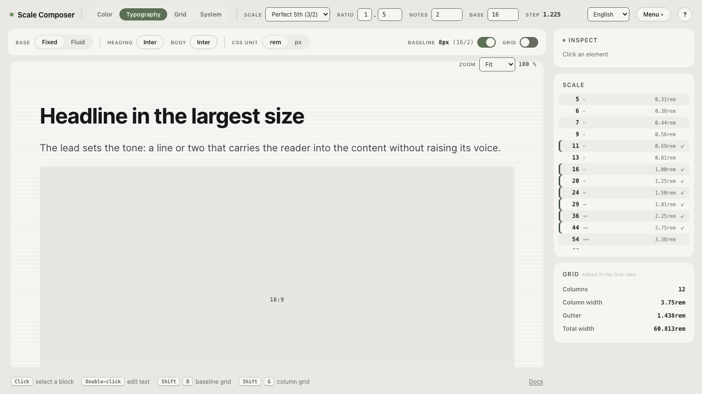
Scale Composer’s font picker — around fifty curated Google Fonts — makes the evaluation concrete: set a candidate as the heading font over your body choice and judge the pairing in real specimen text at real sizes, where x-height and width differences are visible instead of theoretical. Preview a heading candidate against your body font in Scale Composer — the pairing rendered as headings over paragraphs, at the sizes your system actually uses.
What should the brand guidelines say about fonts?
Three things, written so the decision travels to people who will never read the license: the licensed font and what its license covers, the fallback stack, and the rule that assigns each to a role. A guidelines entry can be this short:
heading font:  "Brand Grotesque"  (licensed: desktop + web; apps NOT covered)
fallback:      Inter, system-ui, sans-serif
body font:     Inter  (open license)
rule:          headings = brand font; body = the stack, always
The rule line is the token thinking from the color world applied to type: one decision, written once, consumed everywhere. The CSS font stack is that policy made machine-readable — so when a surface the license doesn’t cover comes along (an email client, a partner embed, the app the license excludes), what renders is the fallback you chose, not an accident someone debugs later.
How do you test an alternative before committing?
In real text, against the face it must live with. Set a candidate as your heading font and judge it in specimen text — swap candidates in the picker, hold the body font still, and compare how each pairing holds up at heading and paragraph sizes before any license conversation starts.