Why AI Dark Modes Look Wrong: Inversion vs Derivation
Ask a coding assistant to “add dark mode” to a project and read the diff it produces. The move is remarkably consistent: white backgrounds become near-black, light grays become dark grays, dark text becomes light text, the brand accent keeps its exact hex, and the box shadows stay right where they were. Ask an image generator for “the dark mode version” of a dashboard and it performs the same move in paint. Both look plausible in a thumbnail. Neither survives contact with real use.
AI dark modes look wrong because the model performs an inversion — the light theme’s values swapped into mirrored positions — while a working dark theme is a derivation: a second palette computed from the same brand seeds, with its own lightness ramp rising from a deep floor rather than a mirrored one, chroma re-planned for a dark ground instead of carried over, contrast recomputed for every text and surface pairing, and a new elevation logic in which raised surfaces lighten instead of casting shadows. That distinction is the backbone of our dark mode guide; this article is about what happens when an AI is in the loop.
What does an AI actually do when you ask for dark mode?
It reproduces the aggregate look of the dark interfaces it was trained on — not the construction of any particular one. That is the intuitive key to the whole failure: the model has seen a great many dark UIs and knows what they tend to look like; it has never executed the decisions that made a good one. So the output pattern-matches — dark ground, light text, same accent — and two things are missing by construction. The first is computation: nothing checks whether the mid-gray secondary text still clears a contrast floor against the new background, because the model generates plausible values rather than verifying them. The second is stability: each answer is sampled fresh, so asking for “dark mode” twice returns two slightly different themes — the same instability that makes AI-generated interfaces drift off-brand over a longer session. What you get is a picture of a dark theme, in code or in pixels.
Why does inversion produce a broken theme?
Because a light theme’s internal relationships do not survive mirroring — a failure with three distinct faces, unpacked in detail in Dark Mode Is Not Inversion:
- Role logic flips wholesale. A light-theme border sits slightly darker than its surface and reads as a drawn, inset line; mirror the lightness and it sits slightly lighter, reading as embossed. Some relationships should flip — dark text on light rightly becomes light text on dark — while others must not, and inversion cannot tell the difference.
- Elevation loses its signal. Shadows barely register on a dark ground — there is almost nowhere darker to go — so dark themes signal height by making raised surfaces lighter. Inversion carries the shadows across, pointlessly, and produces none of the lightening.
- Color drains. Perceived colorfulness is judged relative to the surroundings: the same chroma value reads noticeably duller against near-black than against white, which is why colors look washed out in dark mode when their values are carried over unchanged.
An AI asked to “make it dark” reproduces all three, because from the outside a dark theme looks like an inversion — the decisions that make it not one are invisible in the finished artifact, so they are invisible in the training data too.
What does derivation mean instead?
Derivation keeps the seeds and re-runs the palette’s construction for a dark context. The dark ramp is not a mirror of the light one: it runs its own lightness curve, with background-class steps settling around L ≈ 0.13–0.19 in OKLCH — a deep neutral zone, not the pure black a mirror produces from a near-white start. Chroma is re-planned rather than copied: raised by roughly 20% against the light values to counter the muting of a dark ground, bounded by what the gamut allows at each lightness. Semantic roles are re-derived rather than re-pointed — text, border and state colors are picked against the new surfaces, with the contrast floors rechecked there, because a pairing that passed on white proves nothing about near-black. And elevation is rebuilt on the lightening convention instead of inherited shadows.
None of this is exotic; it is arithmetic — which is exactly the point. It is computable because the palette lives in a perceptual color model: OKLCH lightness tracks how light a color actually appears (the model builds on Björn Ottosson’s OKLab work), so “derive a new ramp and recheck every pairing” is a calculation, not an eyeballing session. A generative model samples what a dark theme might plausibly be; a derivation computes what your dark theme is.
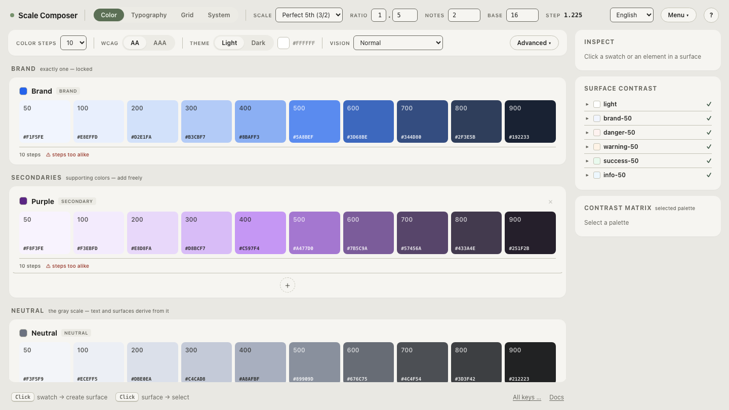
Open a light palette next to its derived dark twin in Scale Composer — the same seed on both sides, and the differences this article describes are readable in the values: the deep-but-not-black floor, the raised chroma, the re-picked text steps.
Does this apply to AI-generated images of dark UIs too?
Yes — same failure, different medium. Prompt an image generator for “the same screen, dark mode” and it repaints toward its prior for dark interfaces: pure-black grounds, accents glowing like a gaming dashboard, white-hot text. That is a look, not a derivation — and it is usually not your look. Negations won’t rescue it: these generators often fasten onto the noun you forbid, so “dark mode but not pure black” tends to anchor on black anyway. Describe the derived theme positively instead, as prompt vocabulary: “deep neutral gray background; raised panels slightly lighter than the ground; soft off-white text; the brand blue slightly more vivid than in the light version.” Those phrases are not mood words — they are the actual decisions of a derived dark theme, stated in language an image model can follow.
How do you get a correct dark theme out of an AI?
Split the work along the line where each side is strong. Derive the dark palette deterministically, export the tokens with the light and dark role sets side by side, and hand the AI the file with one standing instruction: reference the roles, never invent values. A coding model is genuinely good at applying a system across dozens of components; it drifts when asked to decide the system — the recurring shape of the whole AI and design systems problem. For images, the same file is the vocabulary source: the dark theme’s tones have names and values too, and they belong in the prompt exactly the way the light palette does.
Derive the light–dark pair from your own brand color — paste one seed, get both themes with their contrast rechecked, and export the pair as one file: the deterministic half of the workflow, ready to hand to whichever model builds the screens.